
PROVIDER PROFILES
Rethinking Provider (doctors and hospital) profiles to instill trust and confidence in patients, and drive maximum engagement
ROLE
TEAM
TIMELINE
SKILLS
Lead product designer
1 product manager
2 engineers
5 weeks
Product thinking, User research, Interaction design, Visual design
Impact
At the moment, we have not rolled out the updated experience to enough users to gather statistical significance to validate the success of the new design. However, we're continuing to get feedback from users and iterate on the designs to improve the user experience. So far, we've noticed positive changes and feedback in the following:
+ 30%
Increase in patient engagement
+ 8%
Increase in doctor sign ups in 3 months
- 21%
Decrease in drop-off rate
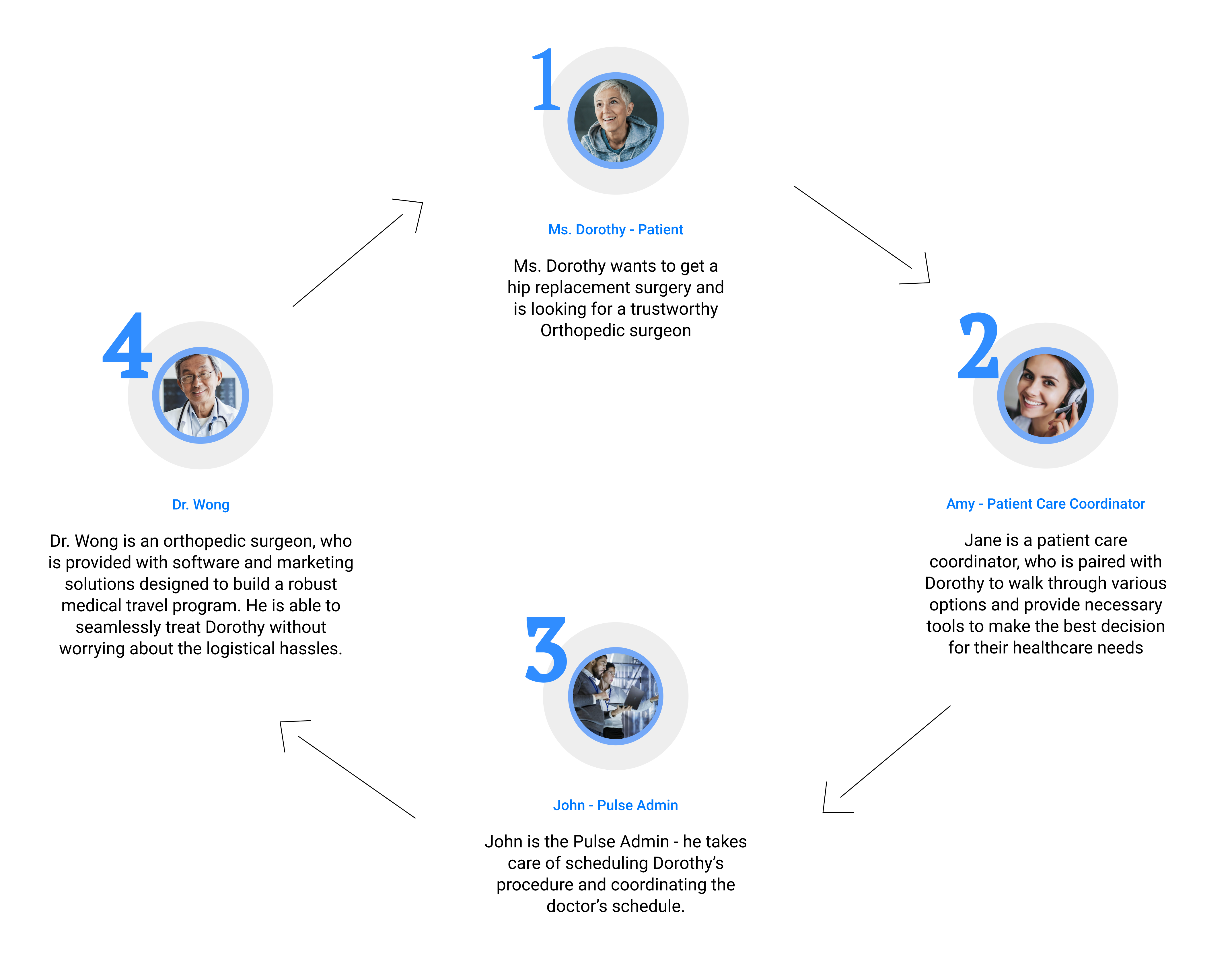
The Company
PulseProtocol provides doctors and hospitals a comprehensive solution to manage professionally manage and scale their medical travel business.
Essentially, Pulse helps doctors and hospitals generate predictable revenue, and facilitates access to great health care for patients at transparent prices.
Let’s consider the following scenario to understand how Pulse helps both patients and providers:
The Problem
The problem with with the current platform boils down to:
➡ Vast numbers of patients are seeking medical care abroad, but they don’t know doctors, who to trust or where to look for reliable information.
➡ The current interface is confusing with overwhelming information, and instills no confidence in the doctors/hospitals.
➡ Hospitals and doctors receive interest, but don’t have any solution to help them capitalize on this demand.
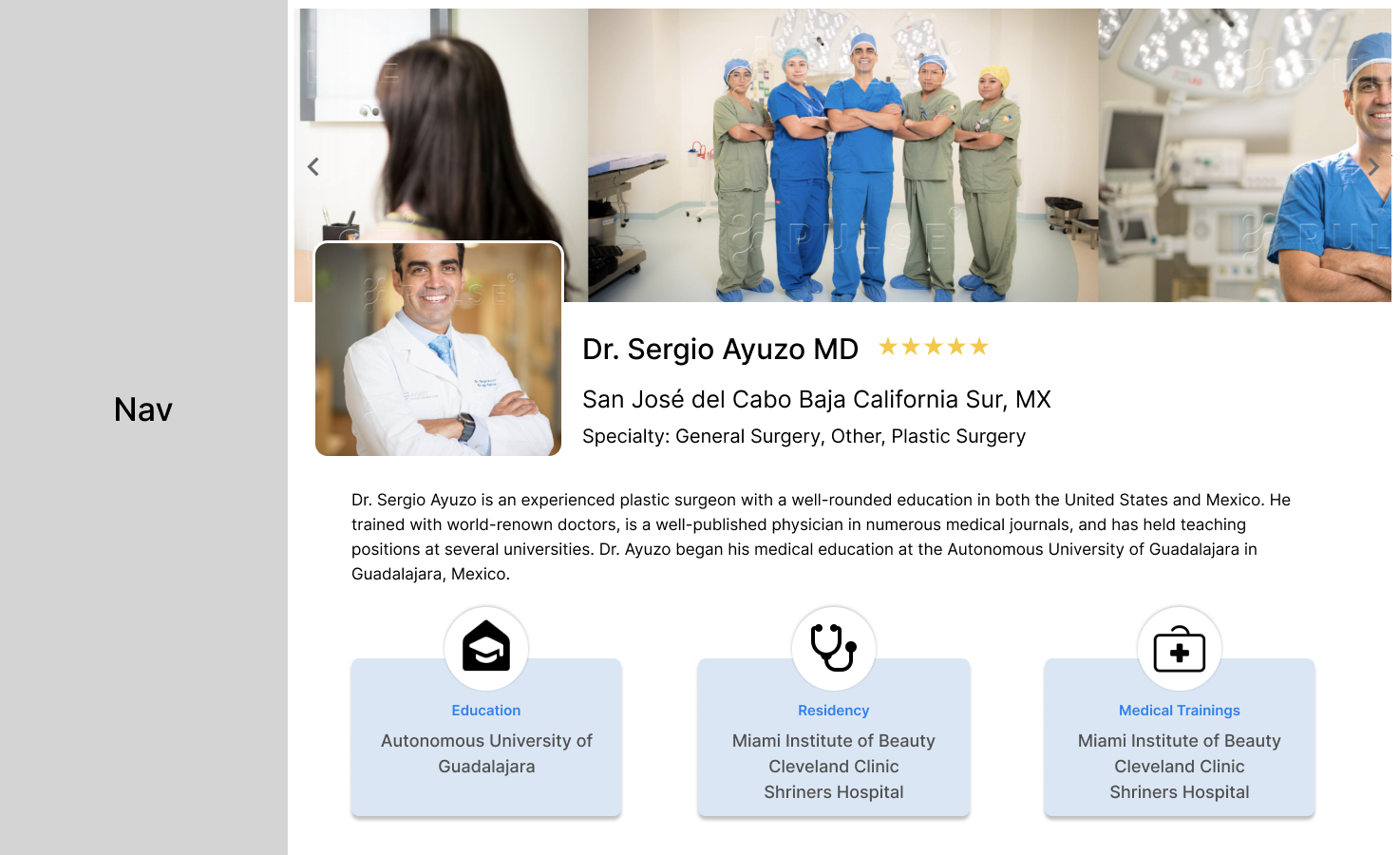
Let's first take a look at previous the old provider's (doctor's) profile...

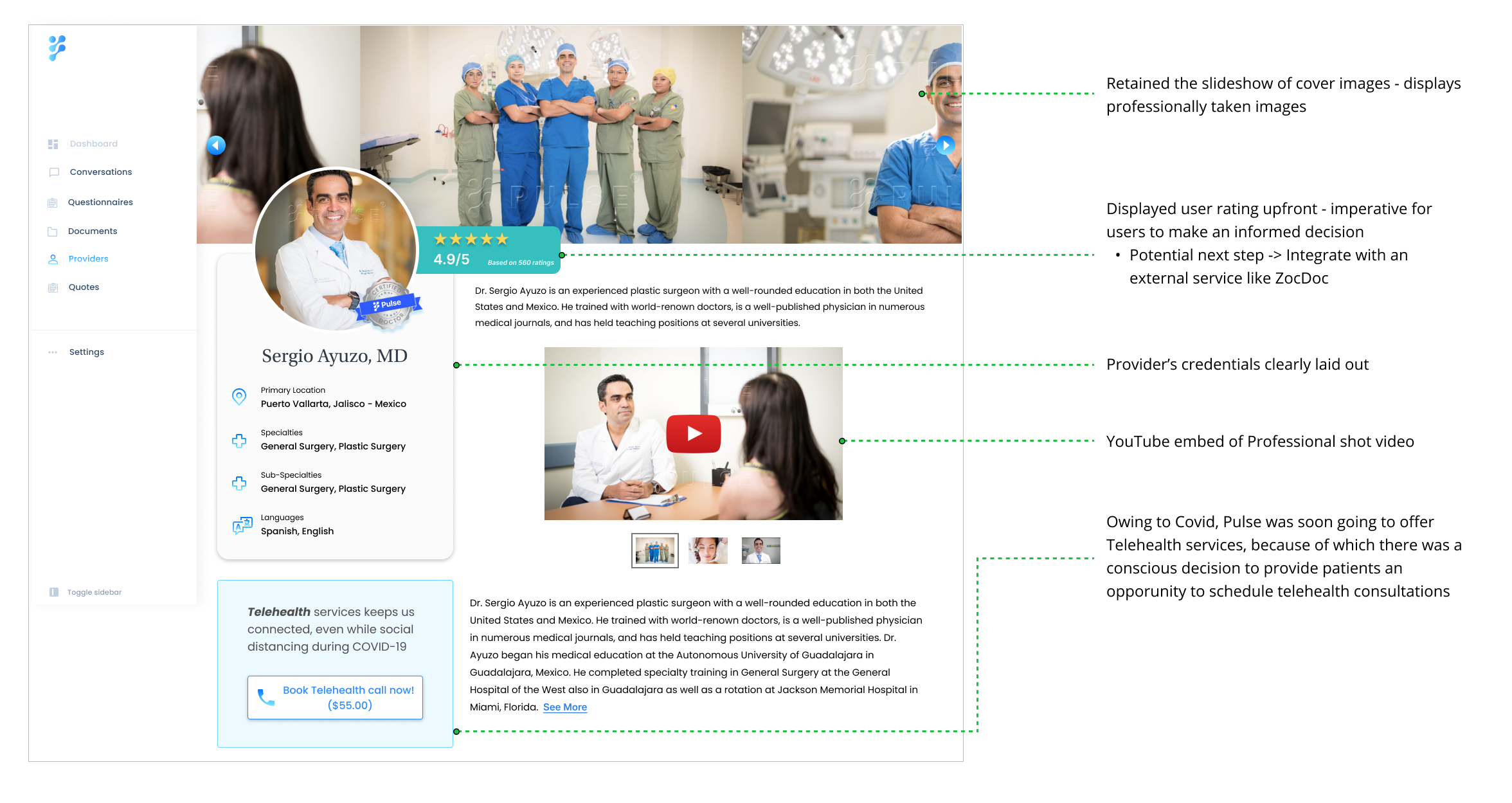
Provider info - Bio, images, location, languages, specializations.

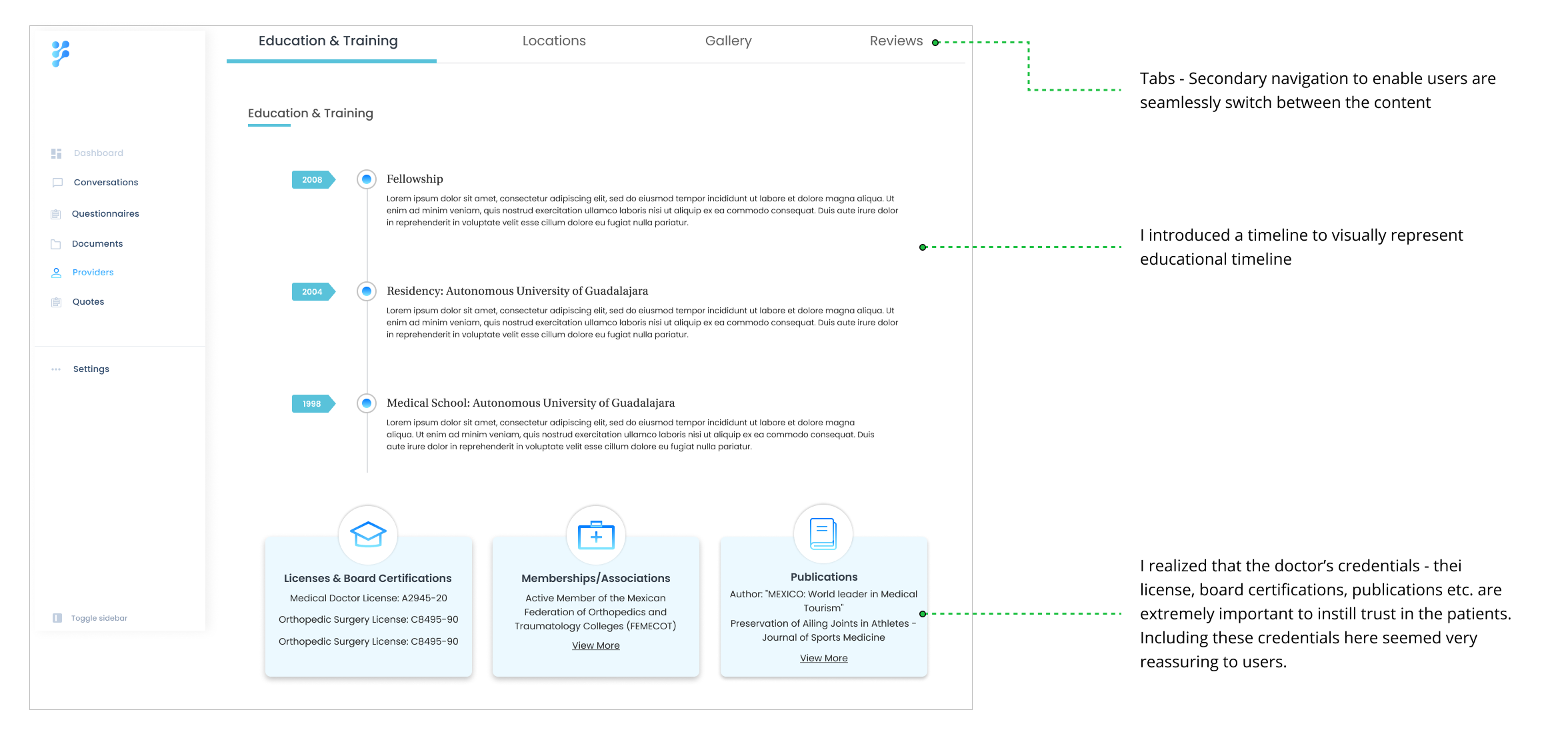
Education and trainings
List of procedures and services offered
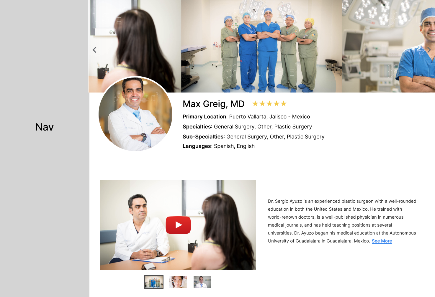
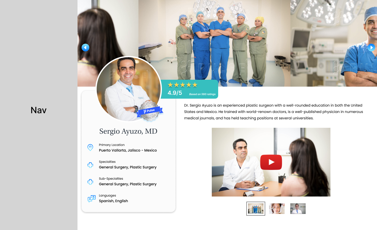
... and after the redesign - VOILA!


LET'S DIG IN..
Research
An extensive study on some of our competitors showed me that Pulse was lagging behind in some key aspects. Off late, we also had a lot of patients who showed interest, but did not return after the first conversation with Pulse admins and care coordinators. To understand what our users need, we split our research efforts into two phases:
Phase 1: Interviewing past and potential patients
We interviewed 18 patients to understand the kind of information they look for, while considering medical travel and what factors are most important to them.
The 5 participants followed a scenario I designed for them and answered a few questions afterwards.
Phase 2: Interviewing doctors
We interviewed 12 different doctors to understand the type of information they’d like to provide for the patients.
MAIN INSIGHTS
1. Users are skeptical about the information on Pulse, especially information about doctors’ credentials, since it is critical for their decision making
2. Pulse does not instantly instill confidence for users in the platform
3. The interface is confusing, so users are unsure where to find the right information
So, why are users having a hard time finding information about doctors and trusting Pulse?
From our conversations with various patients, we identified their most popular grievances


GRIEVANCE 1
Patients are skeptical to trust health care providers that they find on internet platforms
GRIEVANCE 2
There’s not enough information about doctors’ education and professional experience in their profile
LET'S NOW FRAME THE PROBLEM, SHALL WE?!
In what ways may we rethink the provider’s profile by continuing to refine the user experience with new strategies which will improve not only our patient’s experience, but also instill confidence in the platform?
OUR VISION
A one-stop solution for patients to access a secure marketplace, where they can access certified international doctors of varied medical specialities at transparent pricing
Identifying Users' Needs
WHAT DO PATIENTS NEED?
✓ Access to certified and reputed international doctors
✓ Reliable information from reliable sources
✓ Transparent pricing
✓ Simple, easy-to-use interface that does not have a steep learning curve
WHAT DO PROVIDERS (DOCTORS) NEED?
✓ Simple tech solution with on-demand coordination
✓ Minimal time commitment
✓ Capitalize on the demand for medical travel
✓ Access to increased number of international patients
BRAINSTORMING IDEAS..
Design
This project was important not only because every single user expressed frustration with finding information, but also since it provided exceptional value to the business. I brainstormed ideas in various directions, along with anoth designer and the product manager. This exercise proved to be extremely insightful, and we were successful in generating a plethora of ideas.


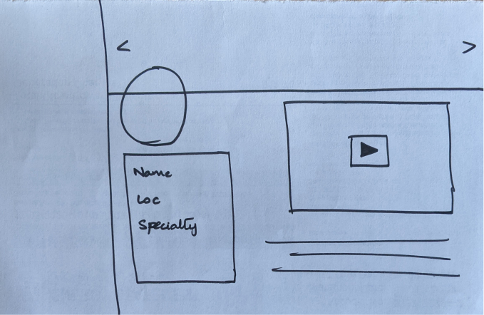
Initial exploration
I initially explored various ways to improve the doctor profile - different placement of information, where could the photos go? More importantly, where could the reviews go? How important are the before/after images? As part of my process, I detailed out every single flow and weighed the pros and cons of each.


Iterate, Iterate, Iterate
When I started off, I had over 50 different versions of the profile page! There were variations of each component - education, certifications, reviews and the gallery. I first began with high-level sketches to get rough ideas on paper before diving into the details.
Page Layout


Exploring page layouts - Version 1
Exploring page layouts - Version 2

Exploring page layouts - Version 3
Exploring page layouts - Version 4
Navigation
» The nav bar was unnecessarily long with redundant menu items. I incrementally reduced the number of menu items
» The icons were repetitive and misleading
» I updated icons to help users associate menu items appropriately

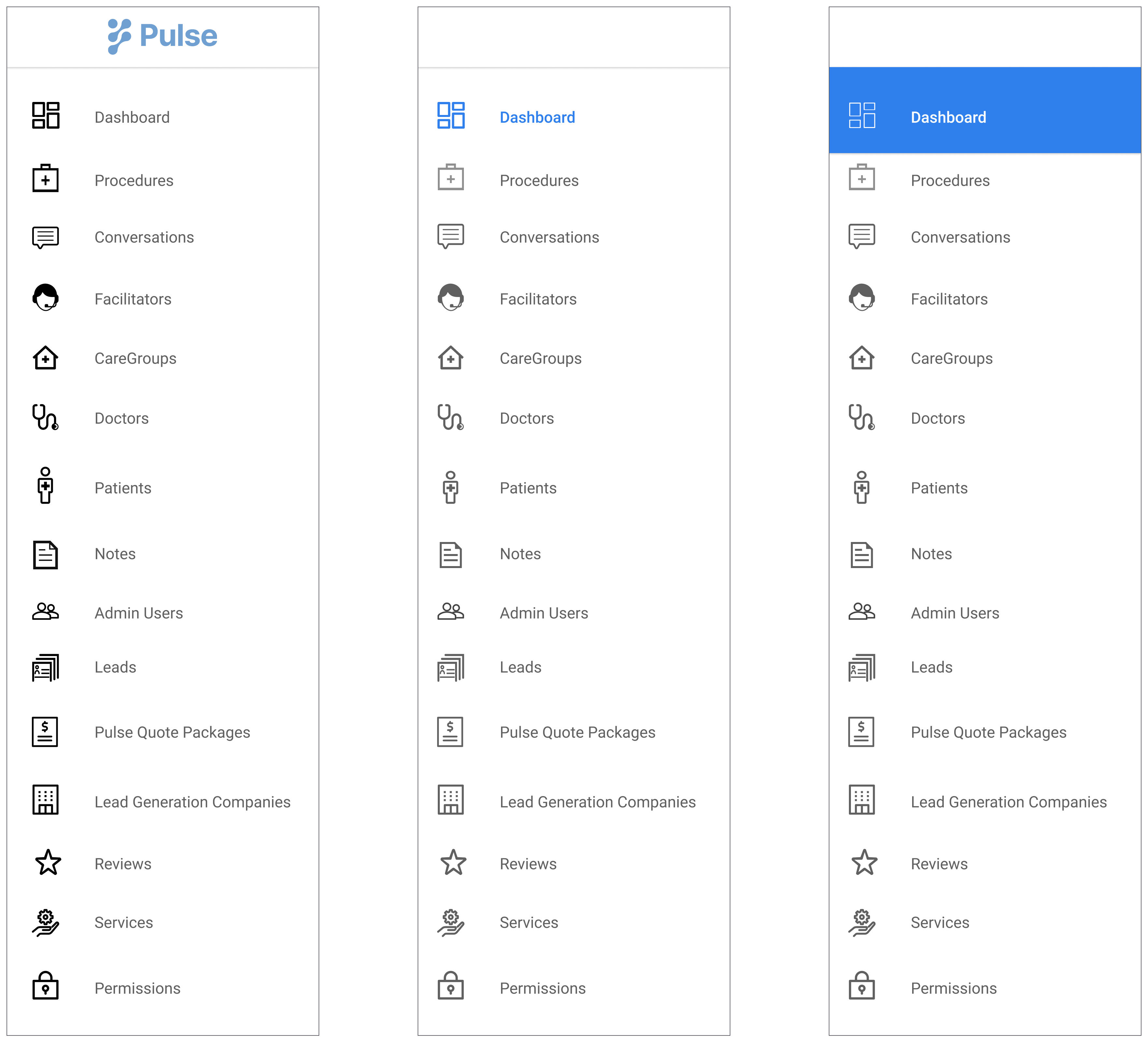
Version 1:
» Appropriate icons, playing around with the primary color
» Still too many menu items

Version 2:
» Fewer and relevant menu items
» Rebranding with updated color and font
Pulse's Seal of Confidence
» Most users (patients) admitted to not trusting Pulse initially because nothing on the platform instilled a sense of confidence in users. It was imperative for me to add elements to the platform that helped reassure users and enable them to trust Pulse and also the doctors on Pulse.
» I explored several approaches
» I steered clear of dark patterns that could potentially mislead patients


» Starting off with basic structure, color, fonts.
» Metallic-finish for a more realistic look
» Playing around with placement of text and layout

Getting there...
We finally have it! 🙌
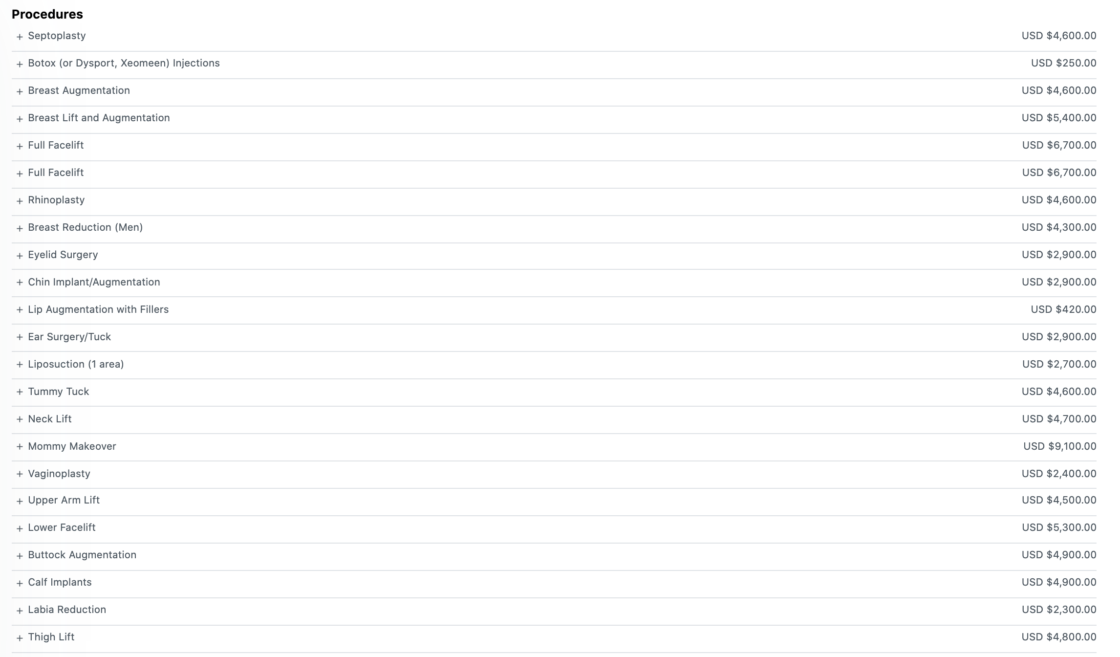
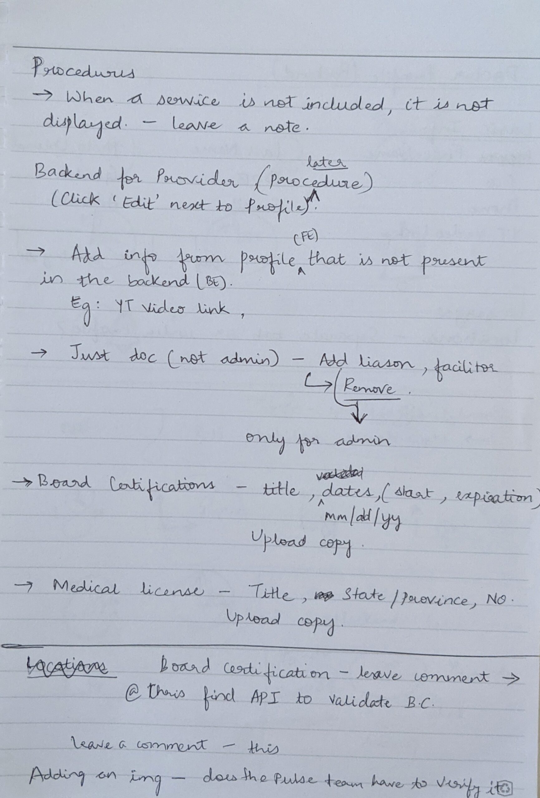
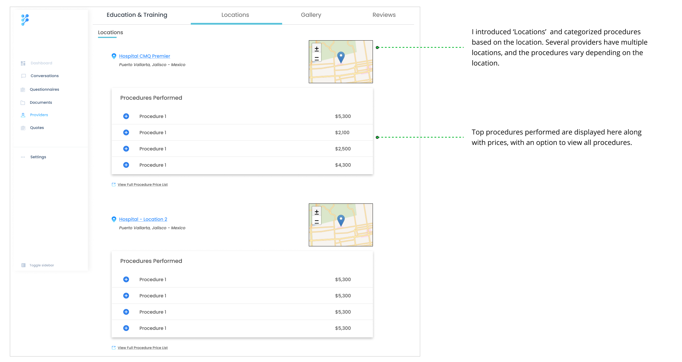
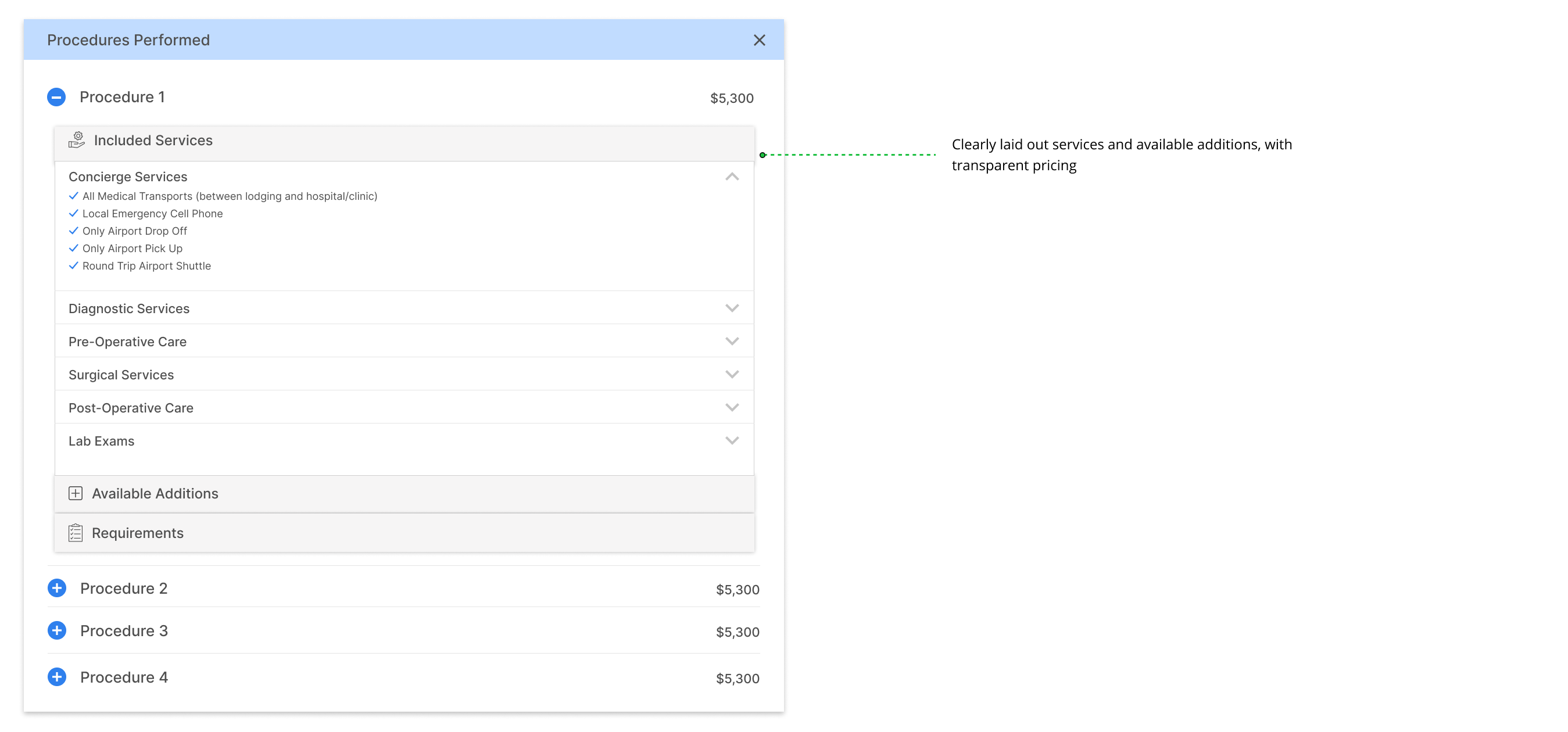
Procedures
» Users want to clearly view procedures and services offered by each provider
» I wanted to display transparent pricing of procedures without any confusion
» Each procedure also includes the included services and the optional services offered for an extra fee
Version 1 - First go at the Procedure layout


Early idea to categorize procedures offered -- Received feedback that procedures cannot always be categorized, especially for dental services.
Version 2
» Refining the layout - We had a tough time deciding if we need a search bar with sort, filter options.
» We finally voted to keep it simple and not provide search.
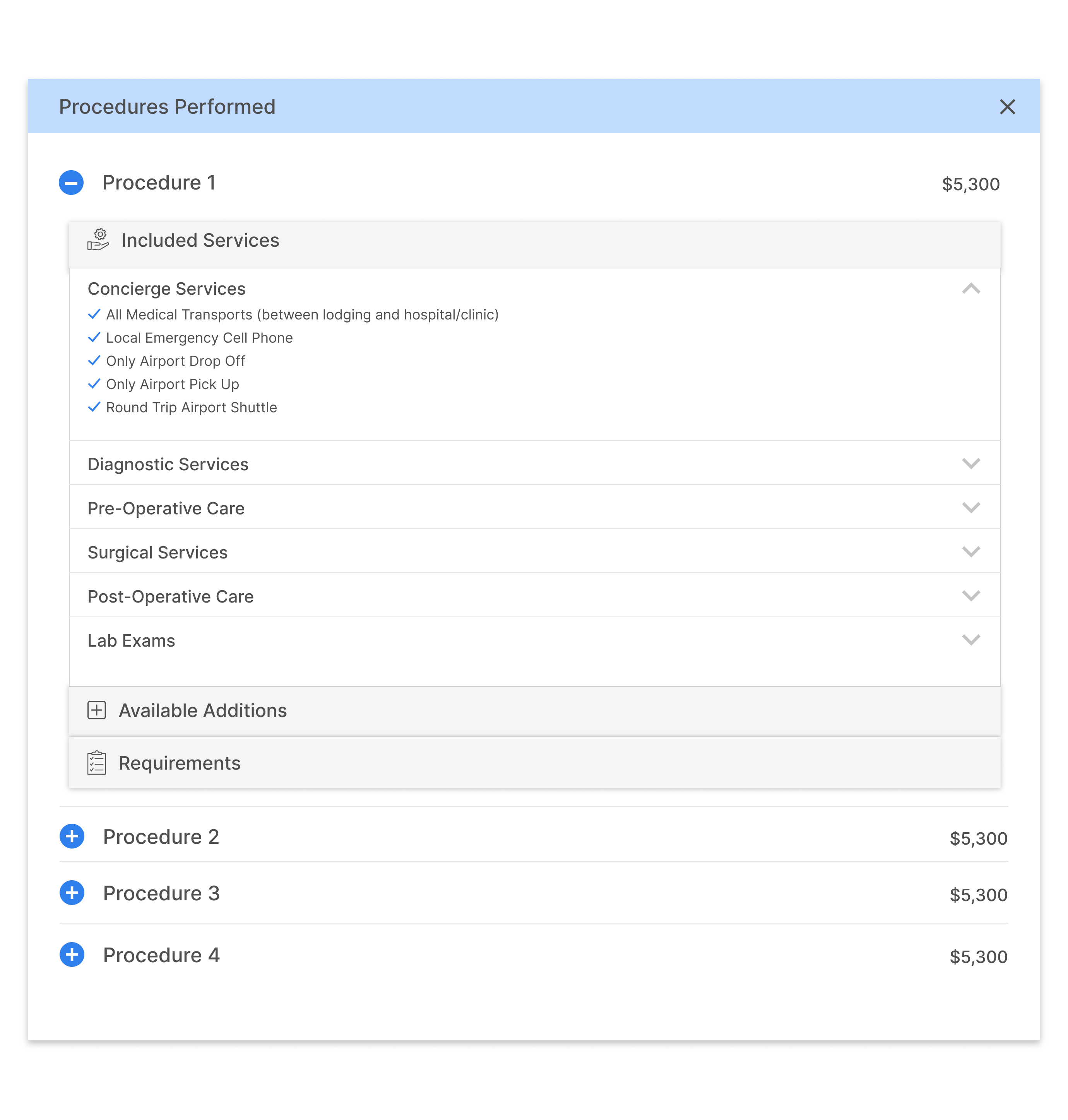
Final version: Procedures, pricing, included services, additions and requirements, with the first card open
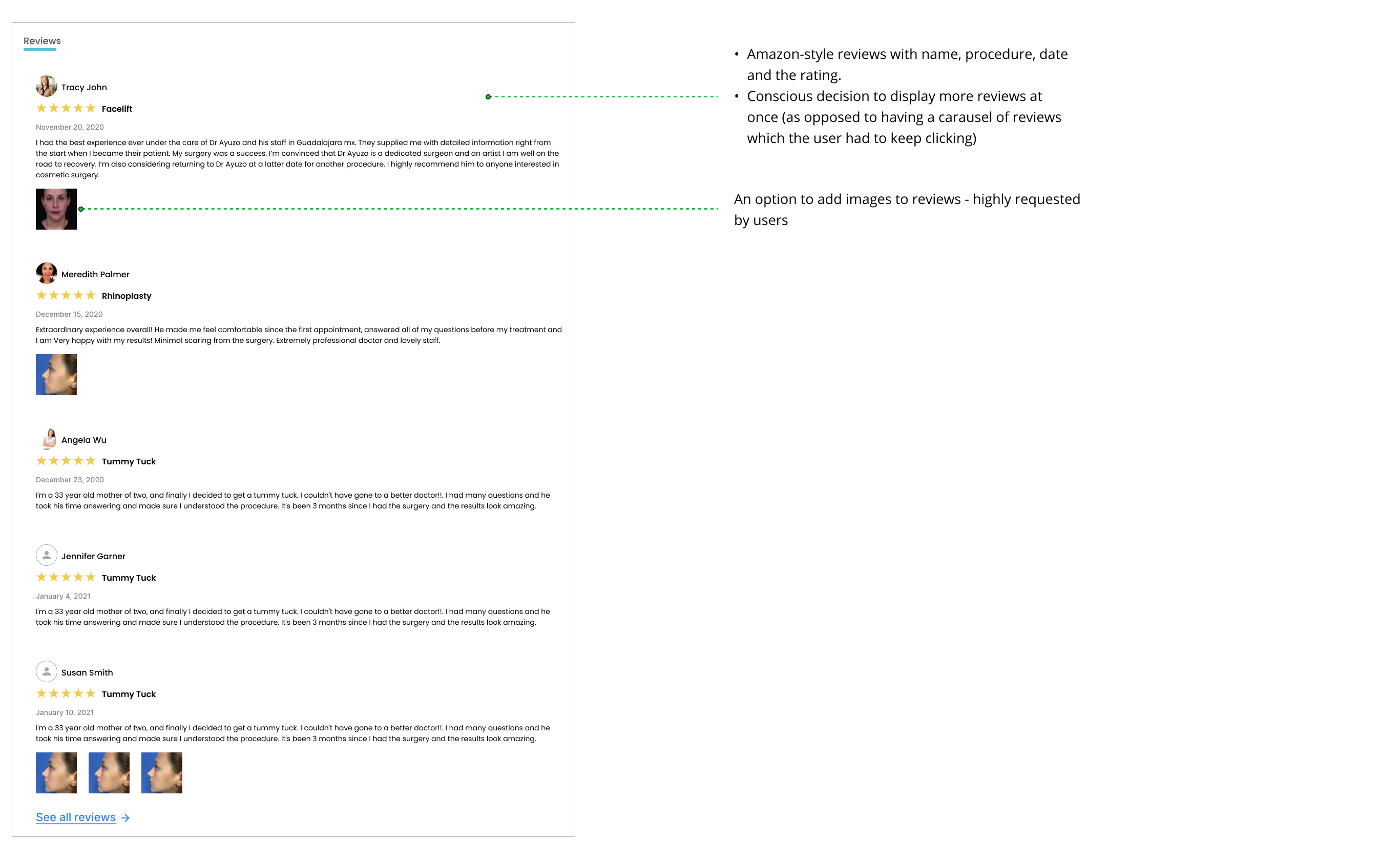
Reviews
» From ordering takeout to furniture, we heavily rely on reviews to make an informed decision. It’s no secret that reviews are one of the most crucial tools for decision making for users.
» Although reviews were present in the platform previously, they were not readily visible, nor were they easy to find.


First go at displaying reviews
- Received feedback that showing just two reviews at once is not sufficient.
- Needs an option to display images in reviews.
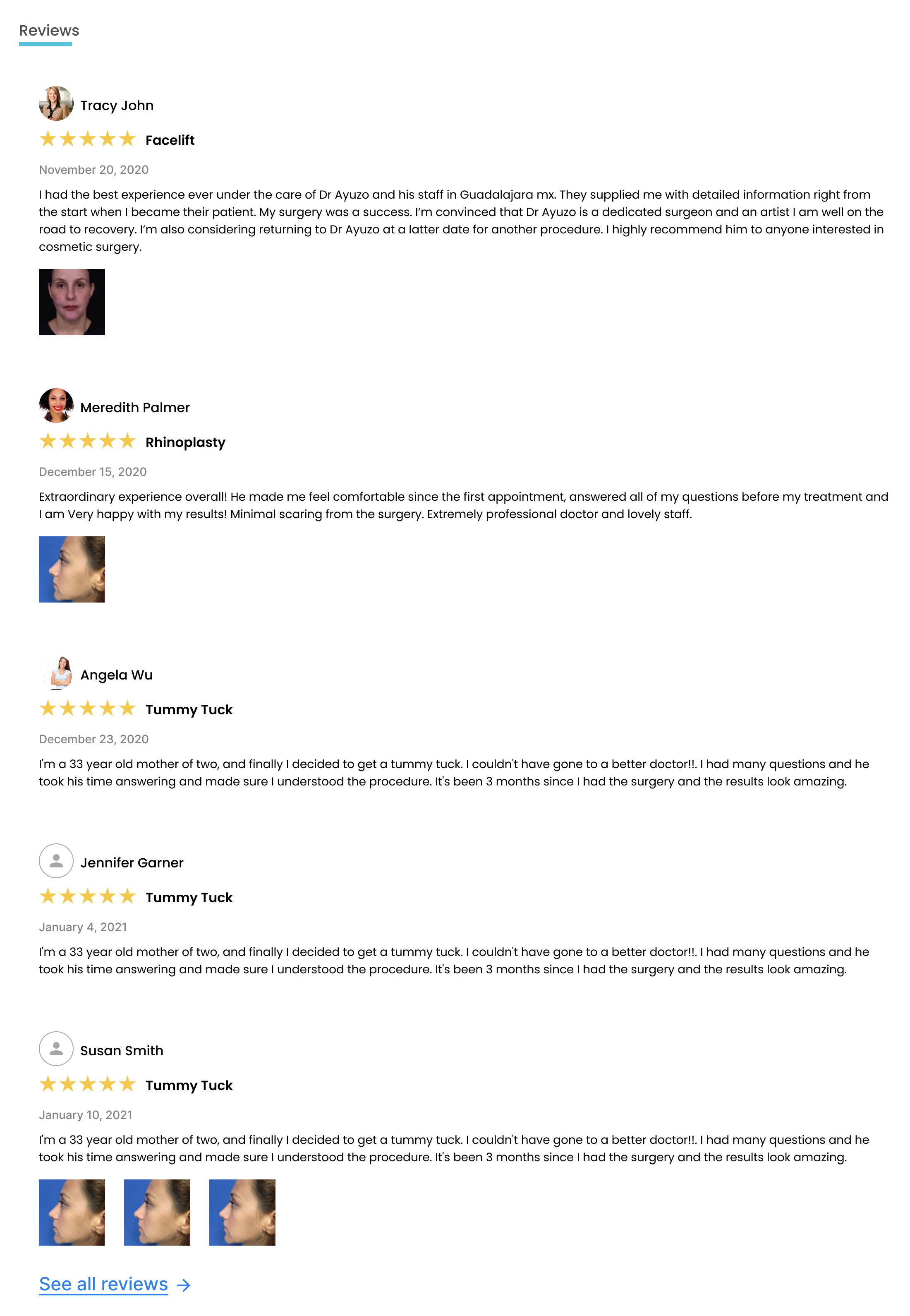
Amazon-style reviews with the patient name, procedure name and date.
Exploring tabs
» Owing to the large amount of information on the provider profile, I explored some ways by which the information can be better displayed
» I also wanted to give users a means to switch between the different sections of information

Exploring second-level side navigation - Rejected, because it would take up a lot of space and leave little space for the content.

Top navigation made most sense - decided to have it stick to the top while scrolling.
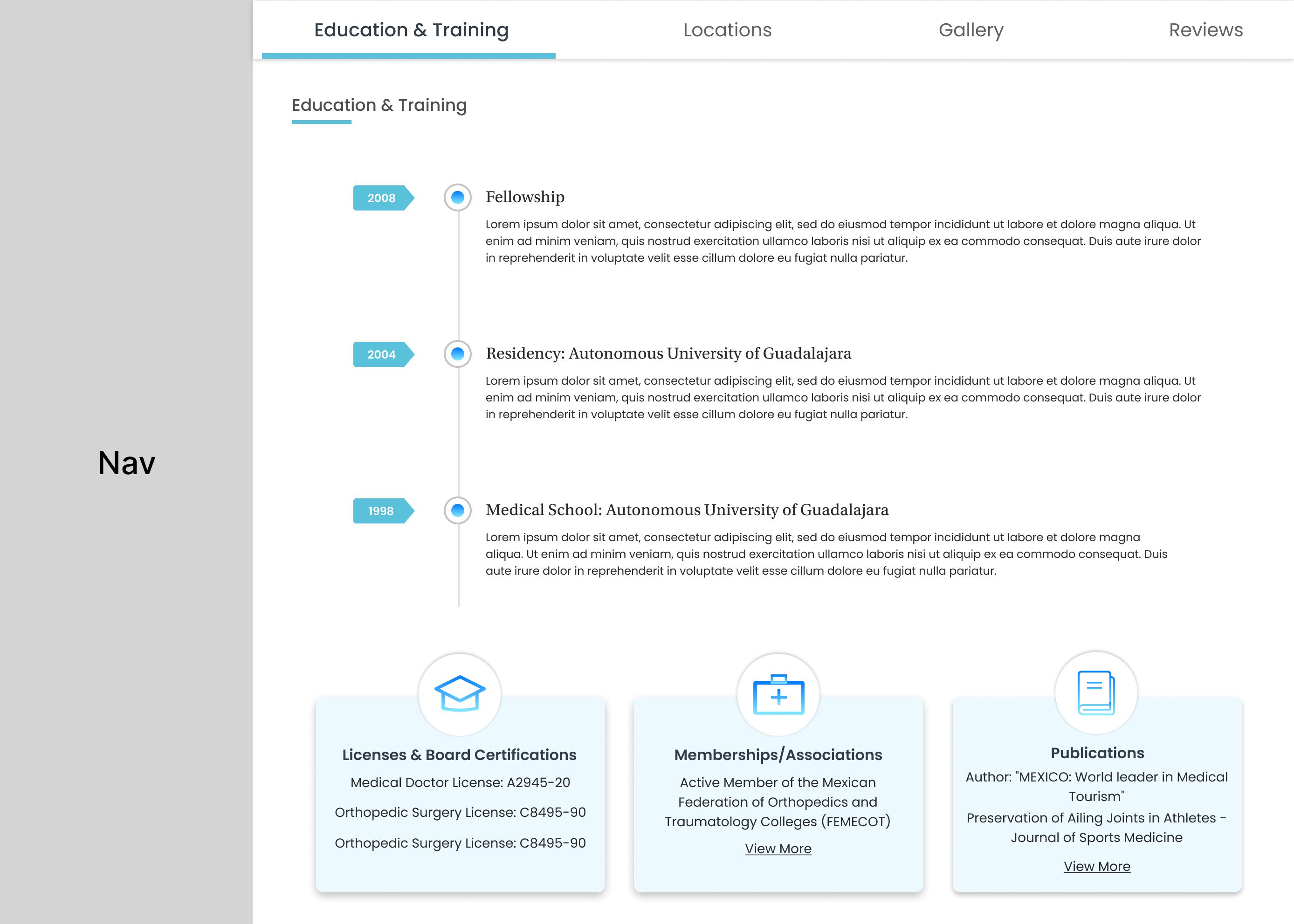
Final version of placement of tabs - with top navigation
... WHAT'S THE BEST SOLUTION? LET'S ASK!
User Testing
I took the time to create some mid-fidelity prototypes and scheduled user tests with some doctors and patients. The participants followed a scenario I designed for them and answered a few questions afterwards.

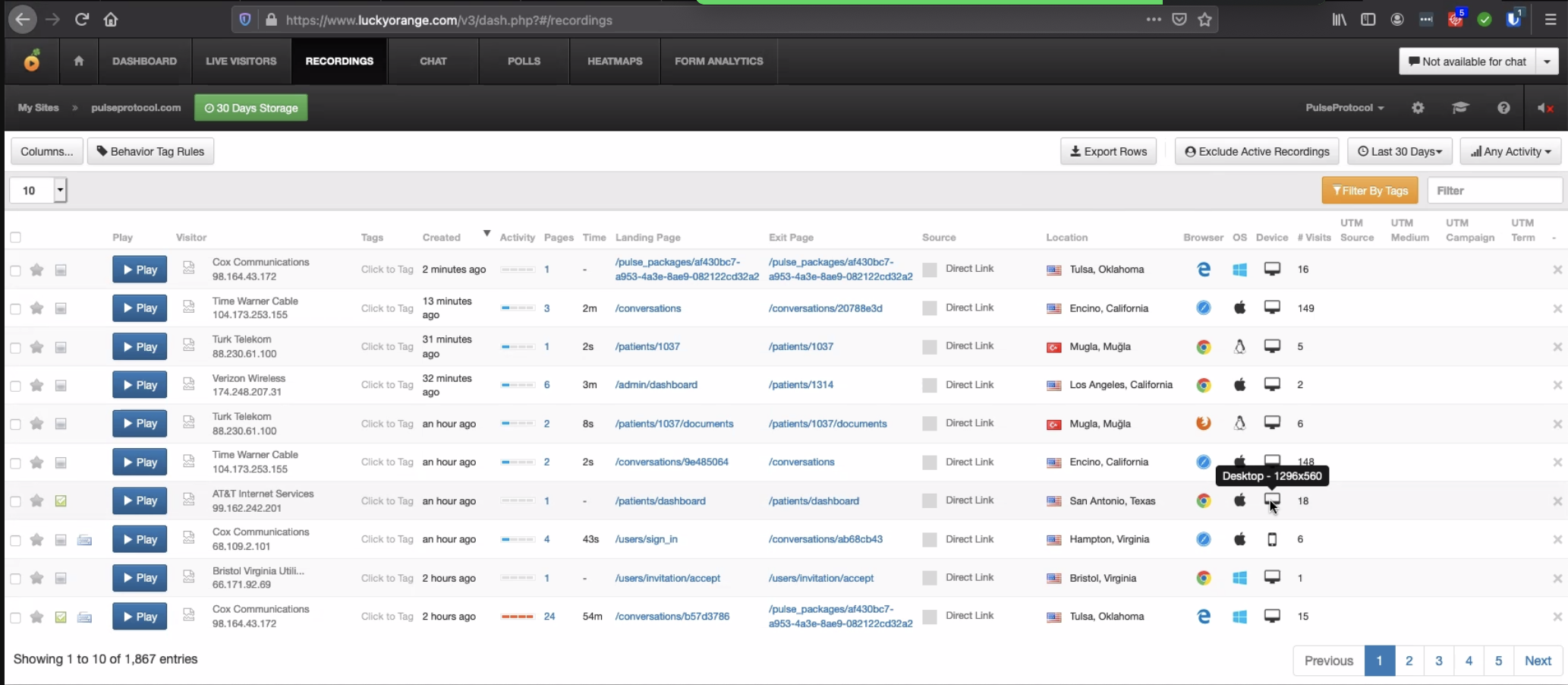
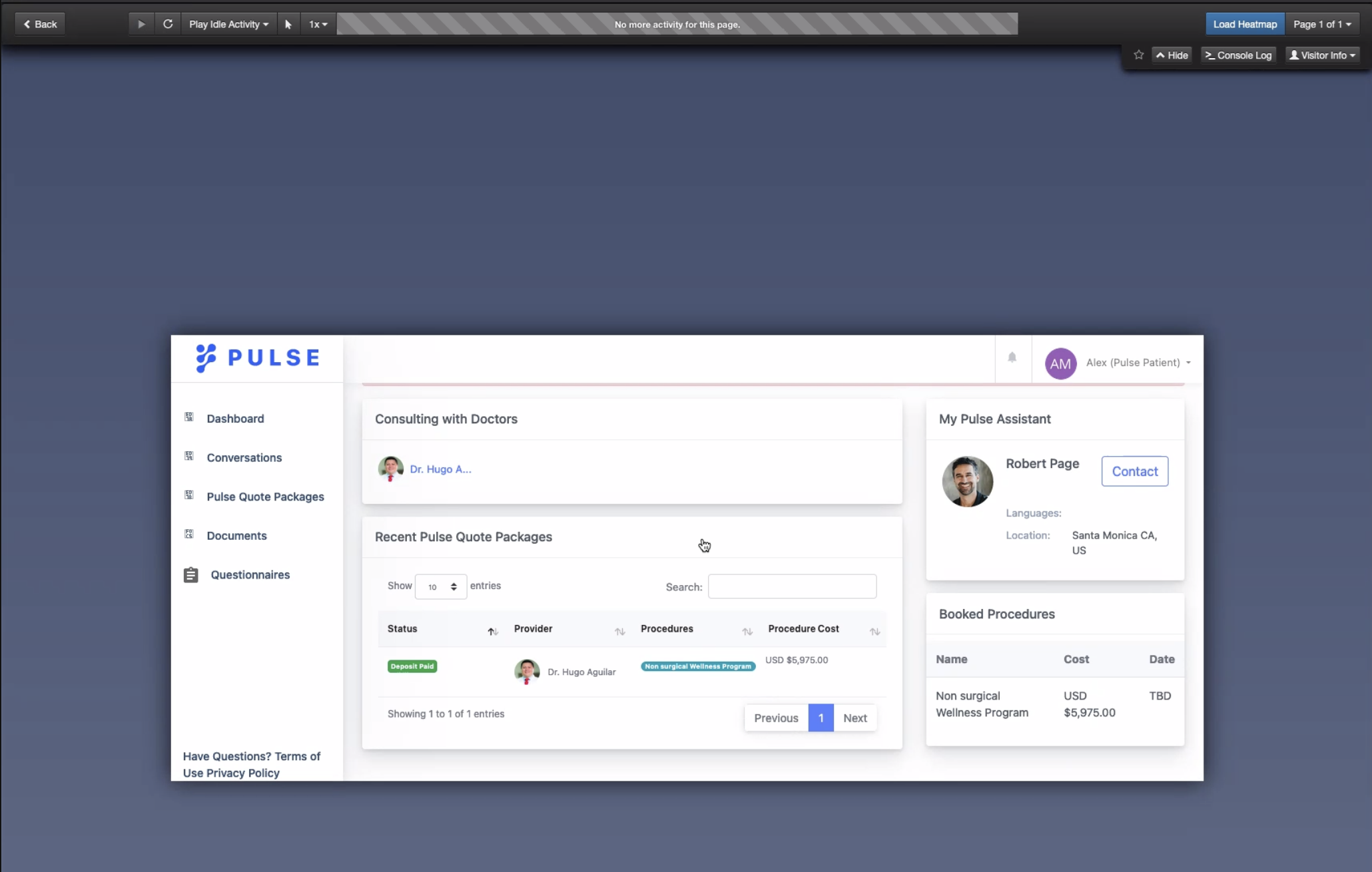

Next, I used LuckyOrange to set up and conduct formal usability tests. Luckyorange provides a means to capture visitors' actions in one clear picture, create heatmaps, identify drop-off in the conversion process and also create a recording of every visitor.
Let's see how the new design compares with the old screens
PROVIDER PROFILE
Old screen
EDUCATION AND CREDENTIALS
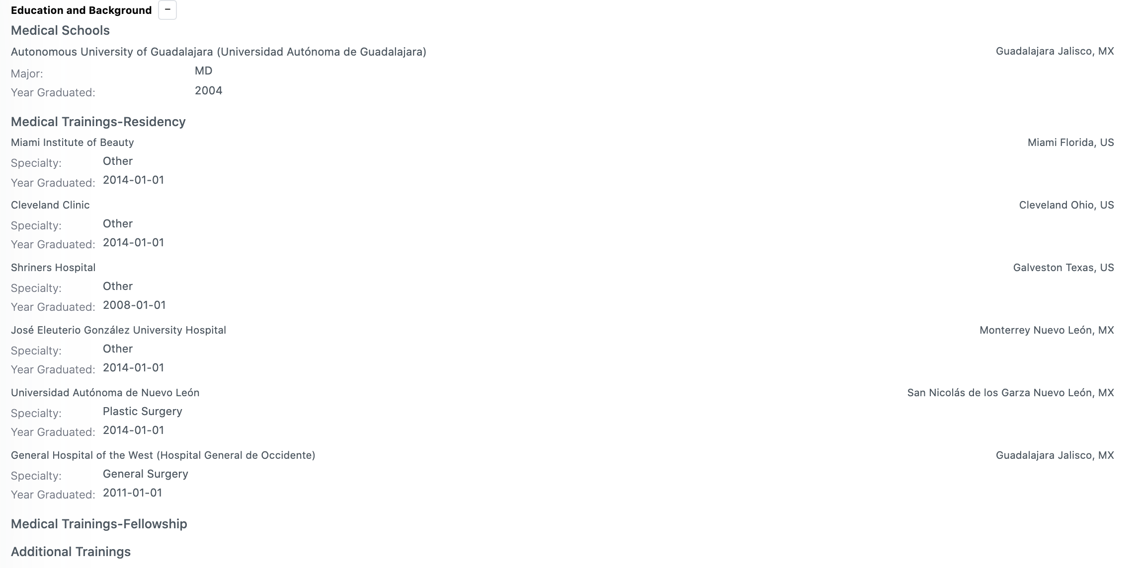
Old screen
LOCATIONS
PROCEDURES
REVIEWS
Learnings


Over-document for easy handoff
Clear documentation makes lives easier for everyone! I learned the hard way that when you leave room for interpretation, your designs probably won’t be engineered to spec.
I had to revisit my designs several times to ensure that component padding, naming conventions, and other forms of documentation were consistent and clear.
Communicate constantly
I realized it is imperative to communicate constantly with all the stakeholders to ensure that everyone is on the same page with respect to requirements and the final outcome. This is especially true while working closely with engineering and product teams.
Selected Works

Microsoft GamingDesigning and shipping Warcraft Rumble's game page

Goldman SachsEnhancing the Agent UI Experience

Base UI Design SystemBuilding & maintaining Blizzard's design system

PulseProtocolImproving usability of doctor profiles to scale business and increase revenue

Ellucian BannerImproving the student experience at higher education institutions