Ellucian Banner
Redesigned Ellucian Banner to enhance learnability, information architecture, and visual aesthetics.
ROLE
👉🏽 End to end project ownership
👉🏽 Information Architecture
👉🏽 User Flows
👉🏽 Interaction Design
👉🏽 Prototyping
TEAM
1 designer (Me 🙋🏽♀️)
1 Product Manager
2 Researchers
DURATION
12 weeks internship
TOOLS
Sketch
InVision
What is Ellucian Banner?
Ellucian Banner is an integrated cloud-hosted higher education enterprise resource planning (ERP) solution. The comprehensive ERP system helps strengthen every aspect of a higher education institution.
Features:
👉 Manage critical student information and deliver services to keep them on track.
👉 Seamlessly manage every aspect of the employee experience–the most valuable resource.
👉 Get insights to improve the institution's financial management and automate financial processes.
In the Summer of 2019, I got an amazing opportunity to work as an Experience Design Intern at Ellucian. I worked on a product called Ellucian Banner, which is an ERP system designed to strengthen every major department in higher education.
I led the redesign of Ellucian Banner Student - I owned the responsibility of the various student modules: designing the flow for a new student's enrollment at a university, degree enrollment, graduation application - to name a few. I worked on redesigning the platform to holistically improve the learnability, visual aesthetics and the overall experience of Banner.
It was a phenomenal experience! I thoroughly enjoyed working with the UX team, developers and the Product Managers and learned so much more than just UX design. 🥳
"The platform is difficult to navigate and the interface is outdated and clunky"
"Which one do I press? Execute or enter? I don't know, so it's a hit or miss, trial and error. Some command keys are not helpful and not explained well"
"I can view or delete information very easily. However, as much as I prefer Banner, there are things that I can't accomplish in the mobile app"
PROBLEM
Ellucian Banner is a popular product used by several universities. It has various platforms for students, human resources, finance, and financial aid. However, the design of the product had a poor user experience, archaic and in a need of a redesign. Users reported several issues, which were tied to poor navigation, unforgiving error handling and confusing website functionalities.
Several students also complained that Banner was not functional on mobile devices. It was previously not responsive and readability was extremely poor.
SOLUTION
I redesigned Ellucian Banner to improve:
Responsiveness: One of the most imperative tasks during the redesign was to be cognizant of the fact that the platform is responsive and provides a good experience on mobile as well as desktop.
Learnability and Digestibility: Redesign Banner to empower users to quickly become familiar with the product, so as to improve productivity and communication in universities, campus-wide.
Information Architecture: Update information architecture by refining navigation and page hierarchy. Provide clear and easy-to-understand breadcrumbs on each page.
Visual Aesthetics: Improve the overall aesthetics of the platform to make it attractive and give a better sense of perception to users. Adhere to the design system and maintain consistency with other Ellucian products.
Ellucian Banner's Impact

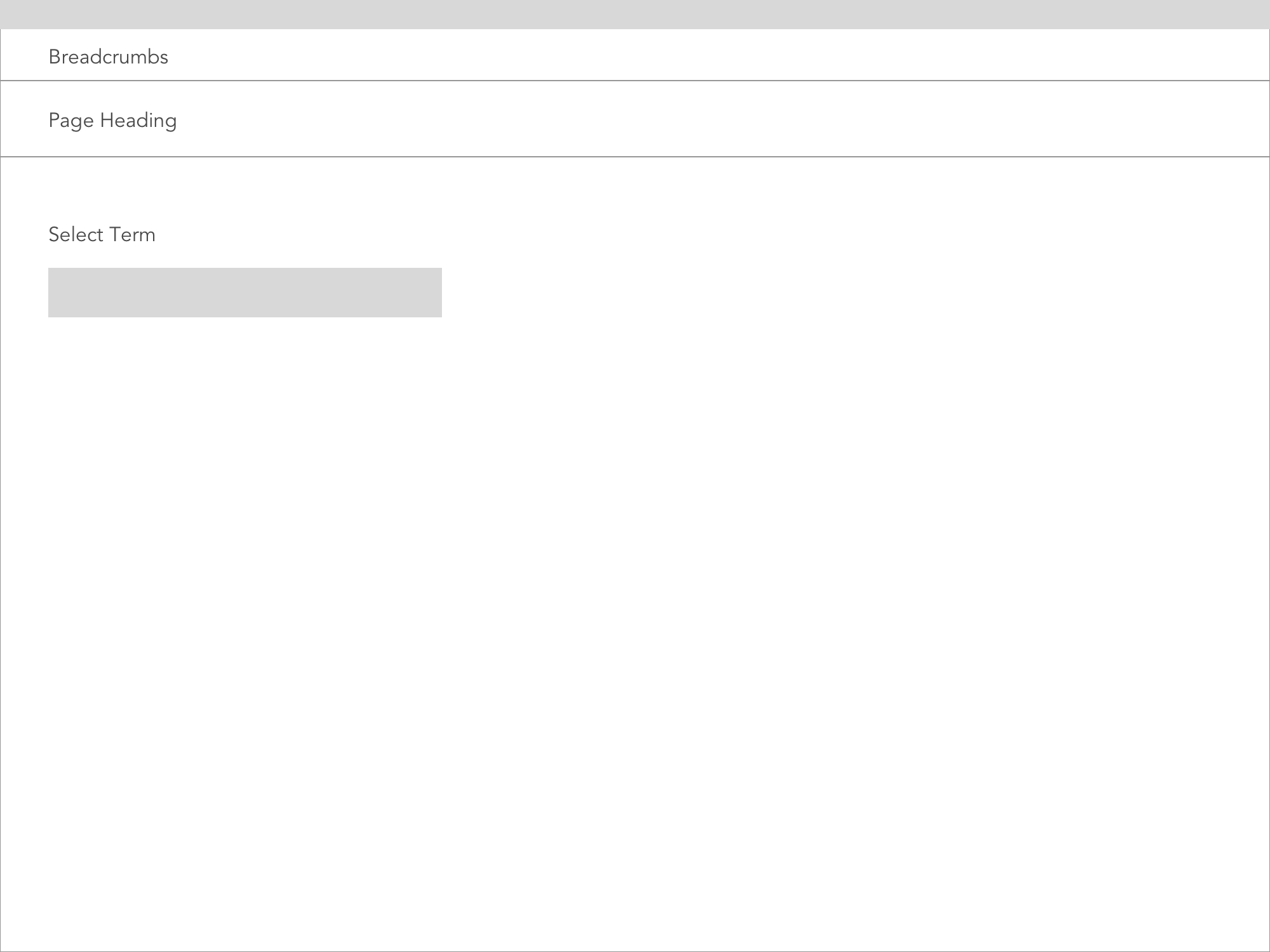
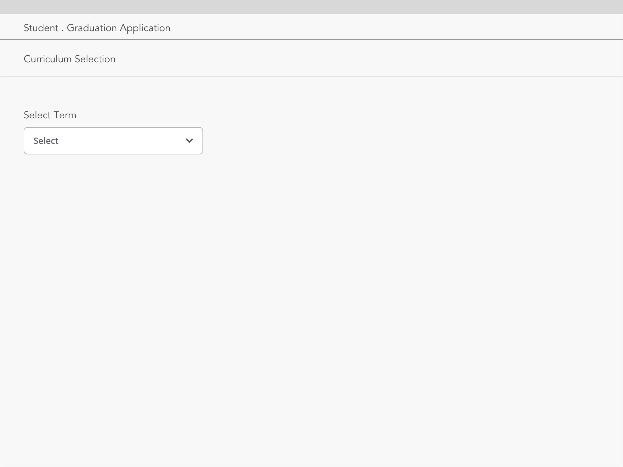
A quick look at the screens before and the redesign
BEFORE
AFTER


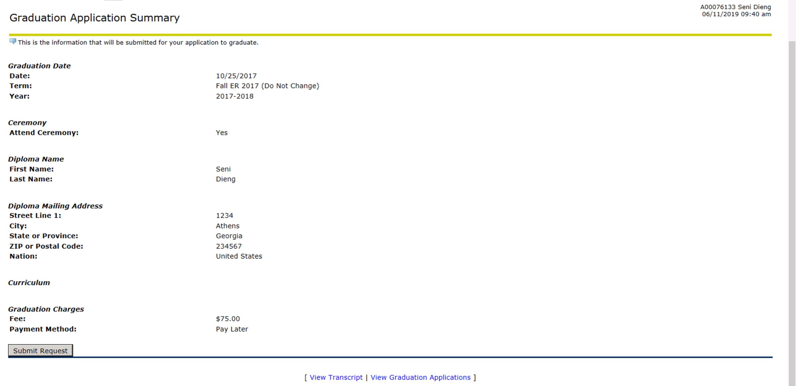


Glide the slider to explore the old and redesigned interfaces of Ellucian Banner
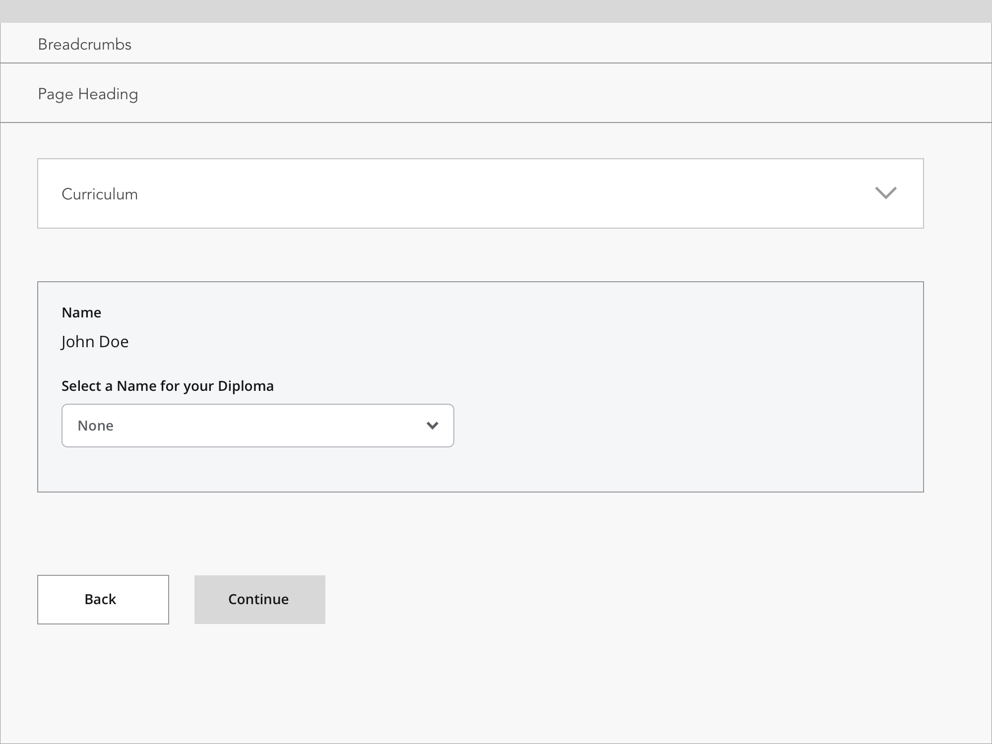
Interactive Prototype
(Click on the "Select Term" dropdown in the screen to interact directly with the prototype)
How might we rethink Ellucian Banner to ensure exceptional user
engagement and elevate the wholistic user experience?
DISCOVERY
I worked with the UX research team to collect in-situ data in order to understand the users' frustrations and pain points. I shadowed the research team to follow their methodologies and the discovery process. The insights we derived from the research informed our design decisions and eventually empowered me to create beautiful and engaging experiences.
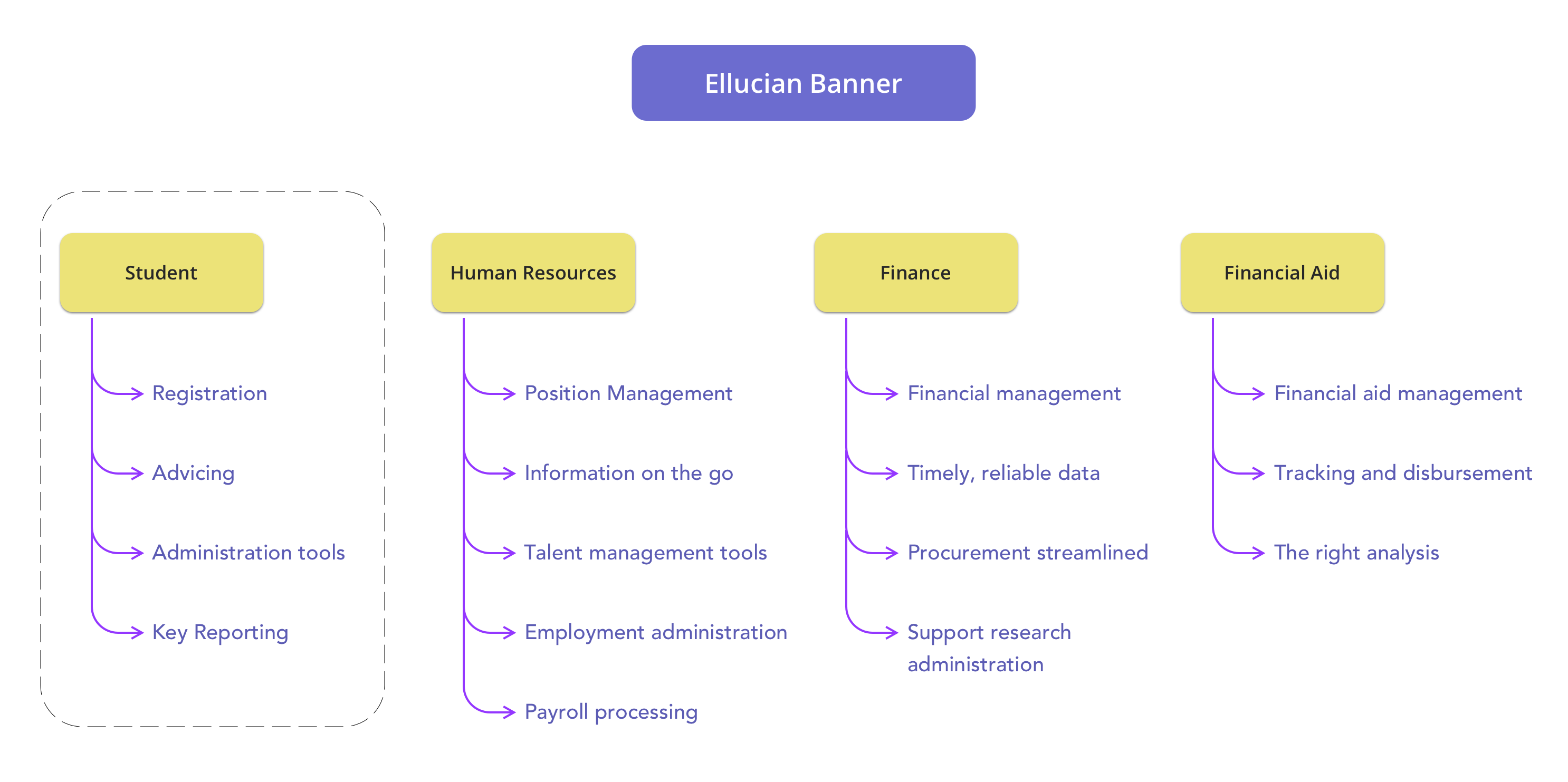
Ellucian Banner's Product Structure
I mainly worked on Banner Student and educated myself on the problem areas.
I then shadowed the research team to learn their methodologies.
I helped the research team conduct user tests on the web and mobile with various students from 3 different universities to answer some crucial questions:
» How does user behavior differ on web and mobile?
» What are some of the main frustrations of users while using Banner?
» How easy is it to find the information a user is looking for?
» Do users use any other app along with Banner to streamline their tasks?

"Some of the titles in Banner confuse you - you think you are on the right screen and you are not."
What does our typical user look like?
Meet Jane Johnson, a freshman at an Ivy League University.
"I need a platform where I can easily enroll in
courses and check my grades without having to
struggle to find this information"
"Navigating the platform is rough and I feel I have to search a lot for any information"
User Motivations:
1. Quickly enroll in courses that she's interested in, before all the slots are occupied.
2. Submit assignments well before the deadline
3. Check grades and the instructor's remarks on time.
4. Enable students to register online on any device
User Frustrations:
1. Has multiple assignments to submit, so she has very little time to waste on navigating the website.
2. The platform takes some getting used to - she has to ask her peers for help to find information.
3. Has a difficult time figuring out input errors.
Student Journey
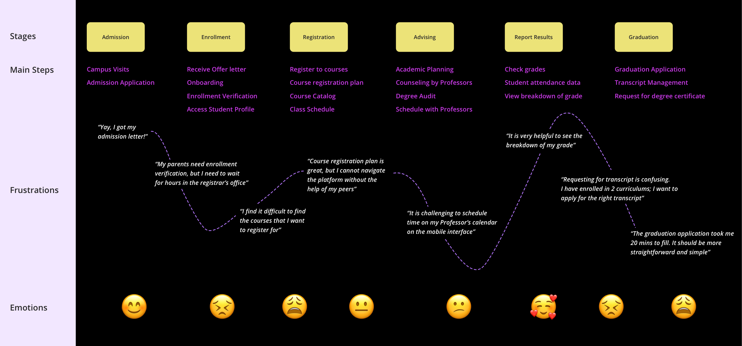
Insights derived from research:
Festures Not Discoverable
Banner's old, obsolete design provided students and faculty with functionalities that were not readily discoverable
Poor Form
Design
The forms were poorly designed and lacked consistency
Bad error
Handling
The interface was not very forgiving - recovering from human-errors could be very tedious and time-consuming.
Archaic
Interface
The interface as a whole was not 'pretty'
IDEATION & DESIGN

With the research insights as a starting point, I next formulated the key drivers to help guide me in my design process.
These design drivers were instrumental in defining my aspirations for the final product and a vision against which I continuously evaluated the product as it evolved.
KEY DRIVERS FOR REDESIGN


IMPROVED PERFORMANCE
Poor performance increases the time taken to complete a task. Leverage UX design principles to improve performance in order to deliver a great overall experience.
Example:
In order to increase performance, I identified the UX factors that impact business goals (Eg: loading times and poor mobile optimization etc.) and the correct KPIs to measure them by (Eg: success rate, task time, error rate etc.)
AESTHETICALLY PLEASING
Good aesthetics in a product leads to better usability and user experience. Improve the visual aesthetics to enhance the designs and interactions to engage users.
Example:
The look and feel of the existing design were not appealing. I redesigned the portal in compliance with the new design system to make it aesthetically pleasing.
SIMPLE AND INTUITIVE
Simplicity is incredibly important in order to provide exemplary UX to meet the needs of the customer. Make the platform intuitive and straightforward to use.
Example:
Various fields in the old design were obscure, which led to a lot of confusion. My main aim was to provide a simple interface that is intuitive to use and enhance the learnability factor.
Brainstorming & Ideation
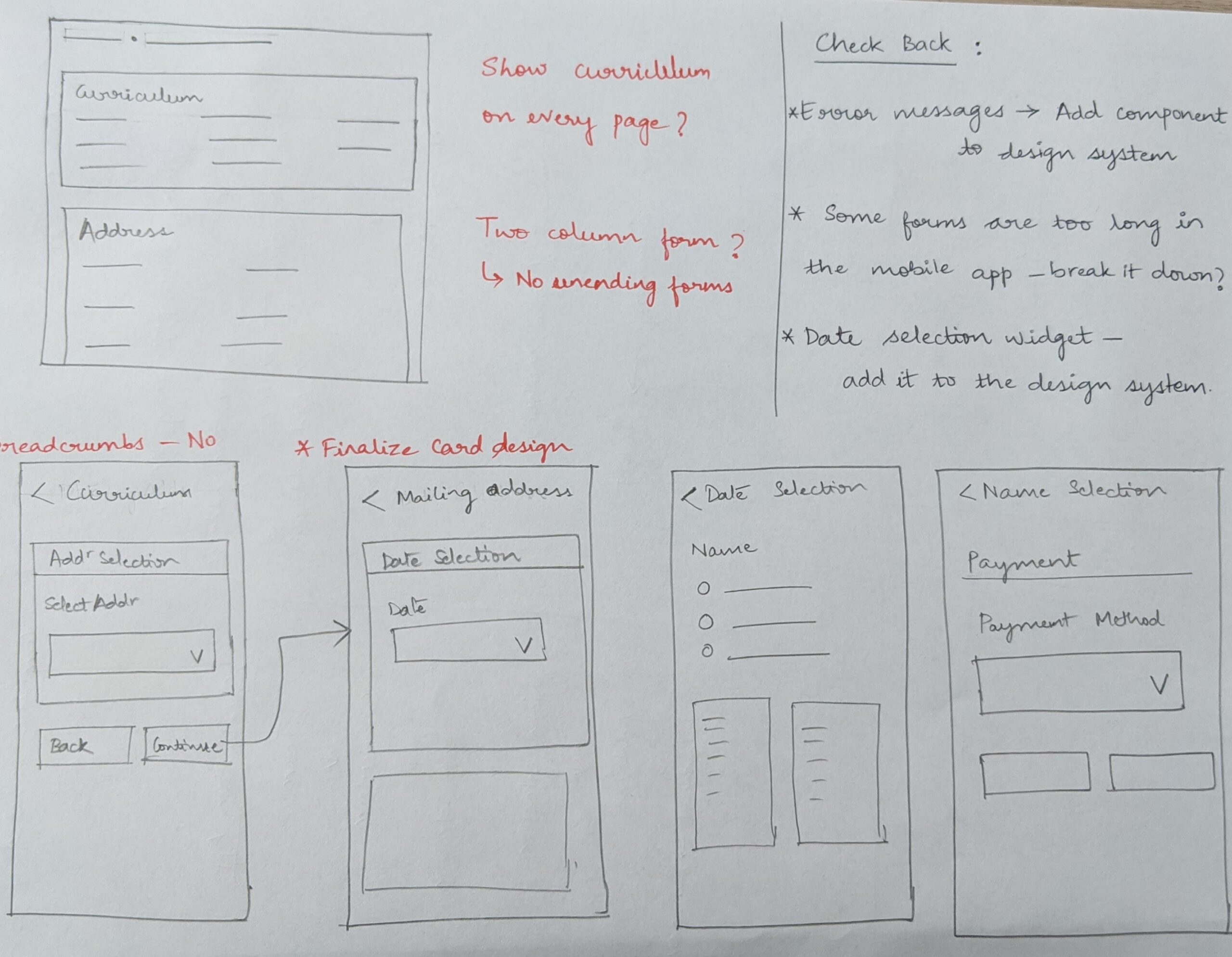
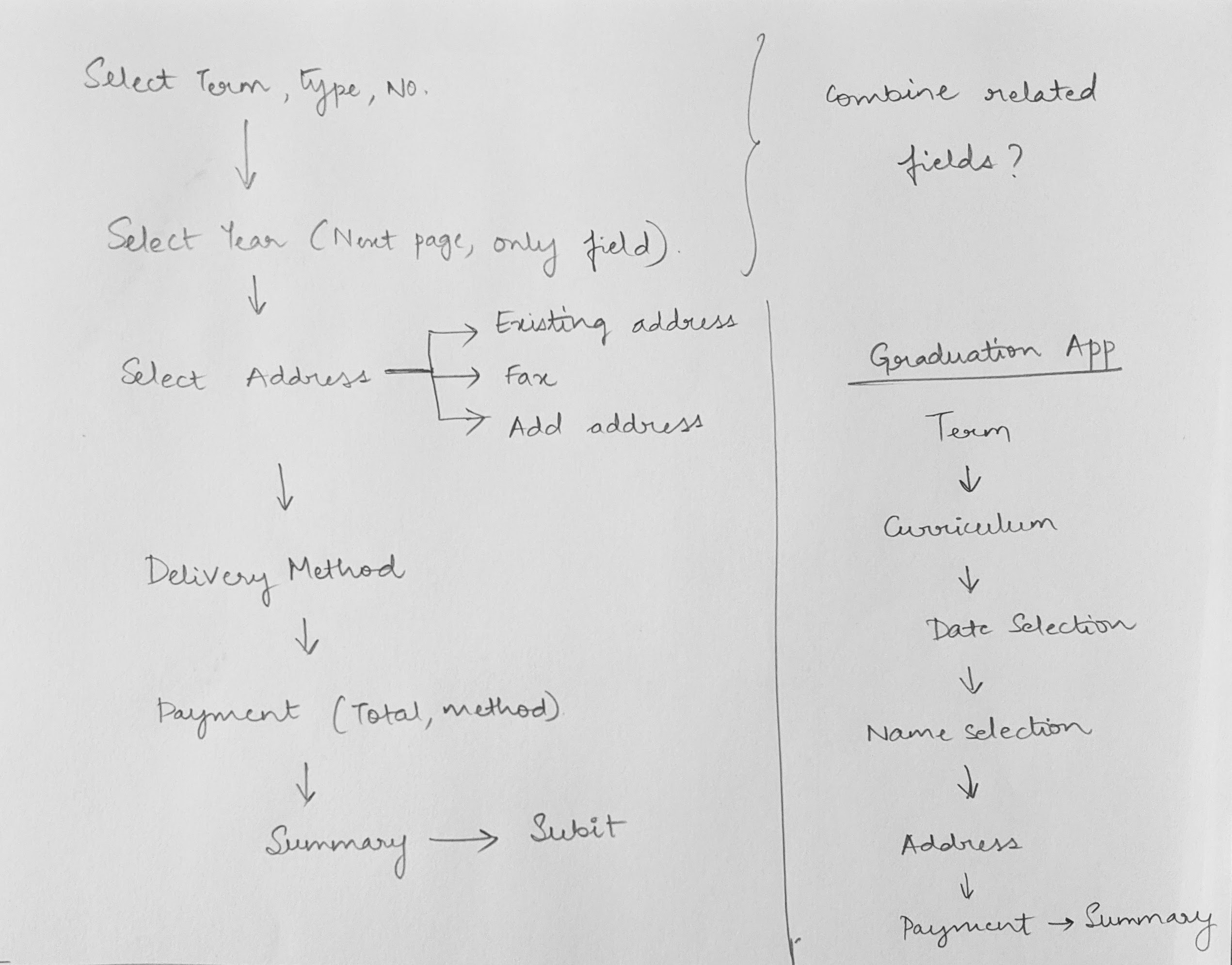


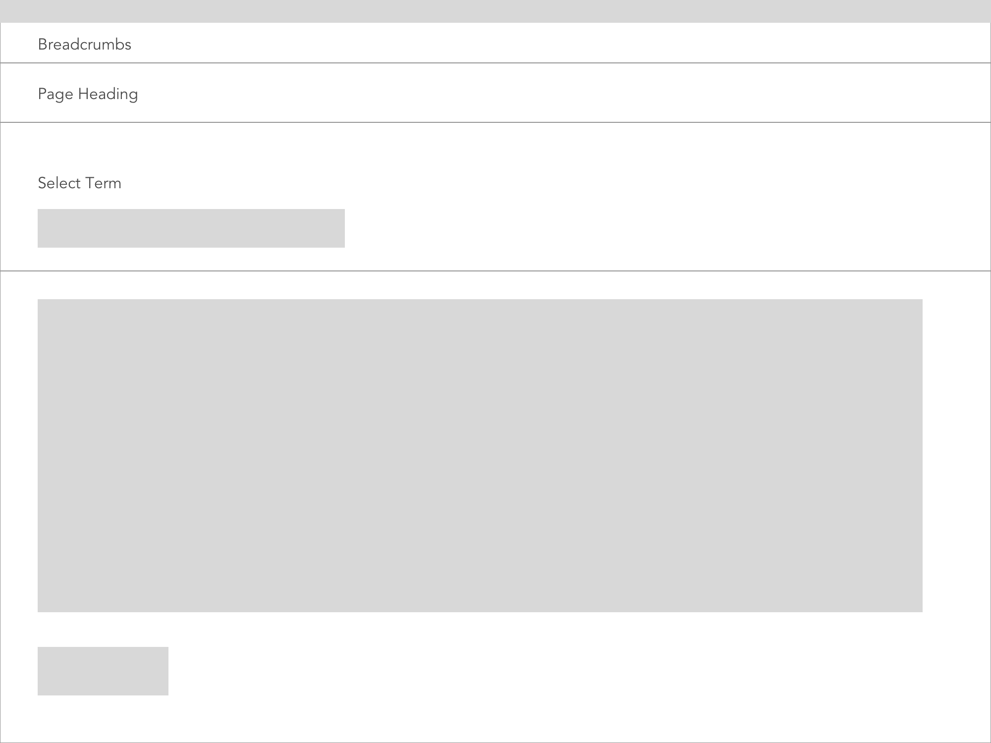


Refining Wireframes


Visual Design - Using Ellucian's Design System
I worked with the Ellucian Design System (EDS) to ensure that user experience is optimized for usability, usefulness and mainly, visual design. I got hands-on experience working with a design system and realized the importance of having a design system, especially when working within a team and across various platforms.
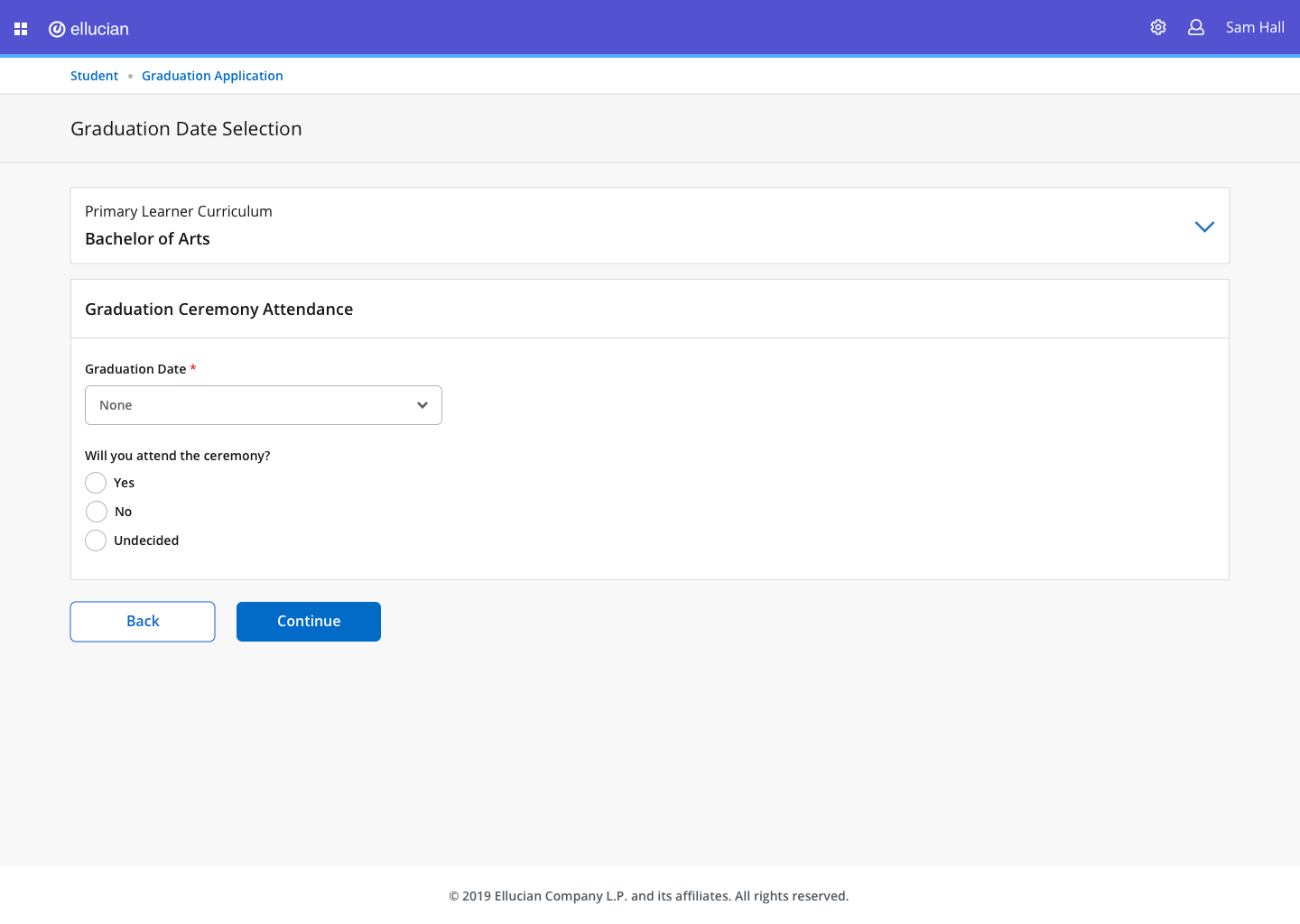
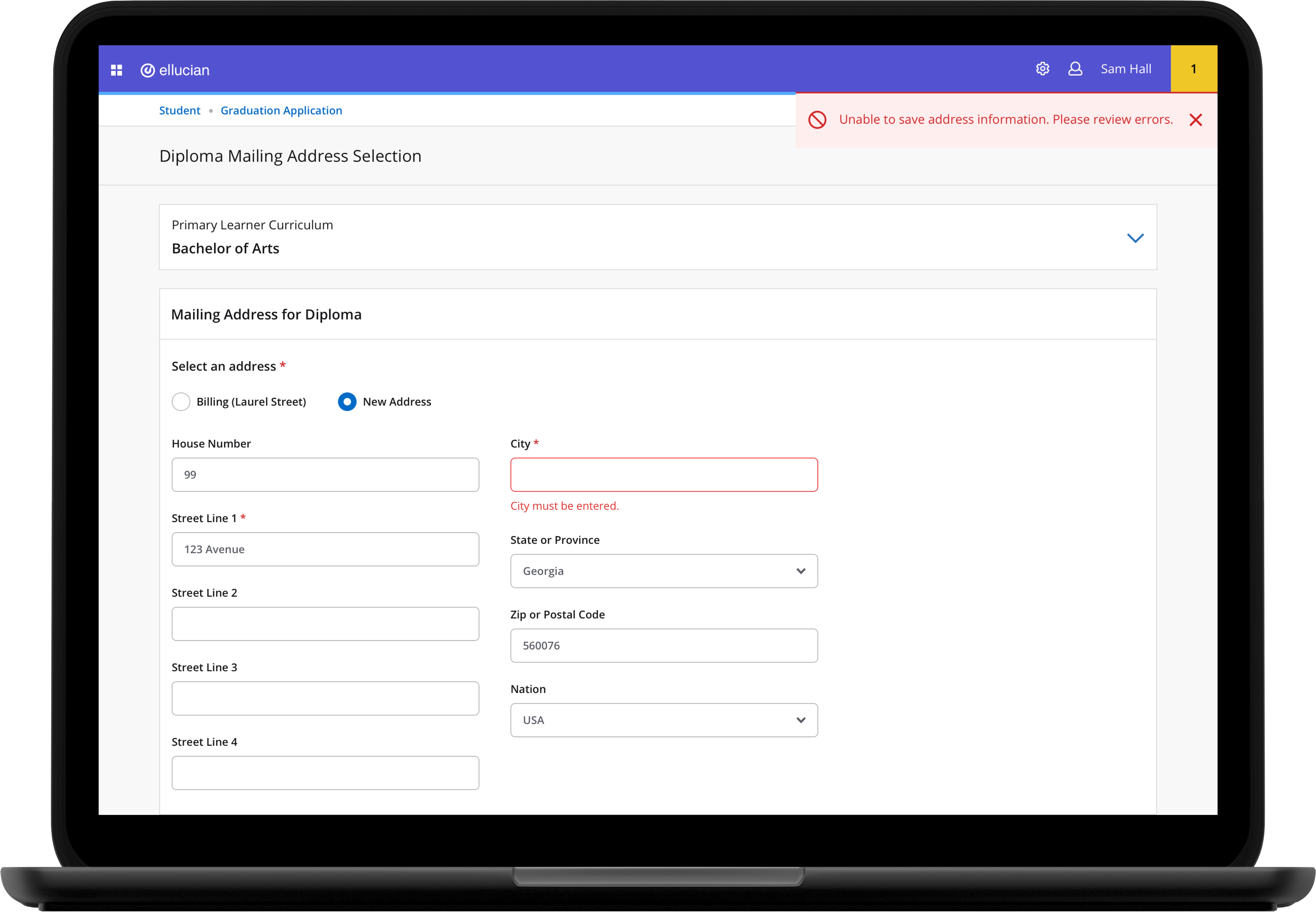
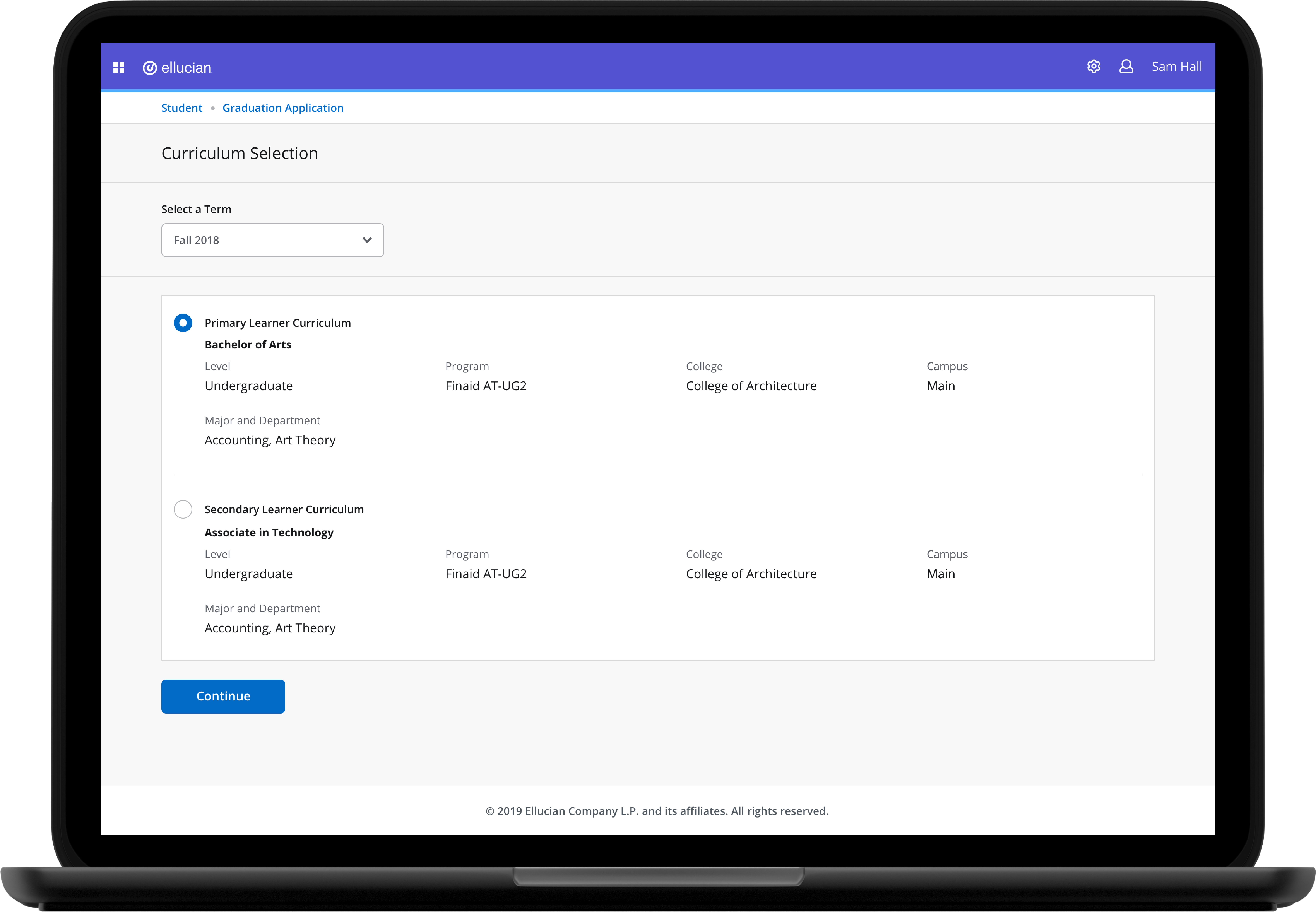
Final Product
Some screens from one of the platforms I redesigned:
*Since my work is NDA protected, I am not at liberty to share all the design screens. Therefore, I have excluded sensitive details and only displayed information that is relevant and instrumental in elucidating my contribution to the project.


Learnings
Be impact focused
Communication is key: Communicate early and often
Collaboration with product managers, developers, and also the marketing team is imperative and provided a great learning experience.
What could I potentially do with more time?
There was a hard deadline of 3 months for this project. With more time, I could:
1. Conduct more usability tests during the course of the project
2. Suggested further changes to the new design system to better accommodate my design decisions.
Selected Works

Microsoft GamingDesigning and shipping Warcraft Rumble's game page

Goldman SachsEnhancing the Agent UI Experience

Base UI Design SystemBuilding & maintaining Blizzard's design system

PulseProtocolImproving usability of doctor profiles to scale business and increase revenue