VisitMe
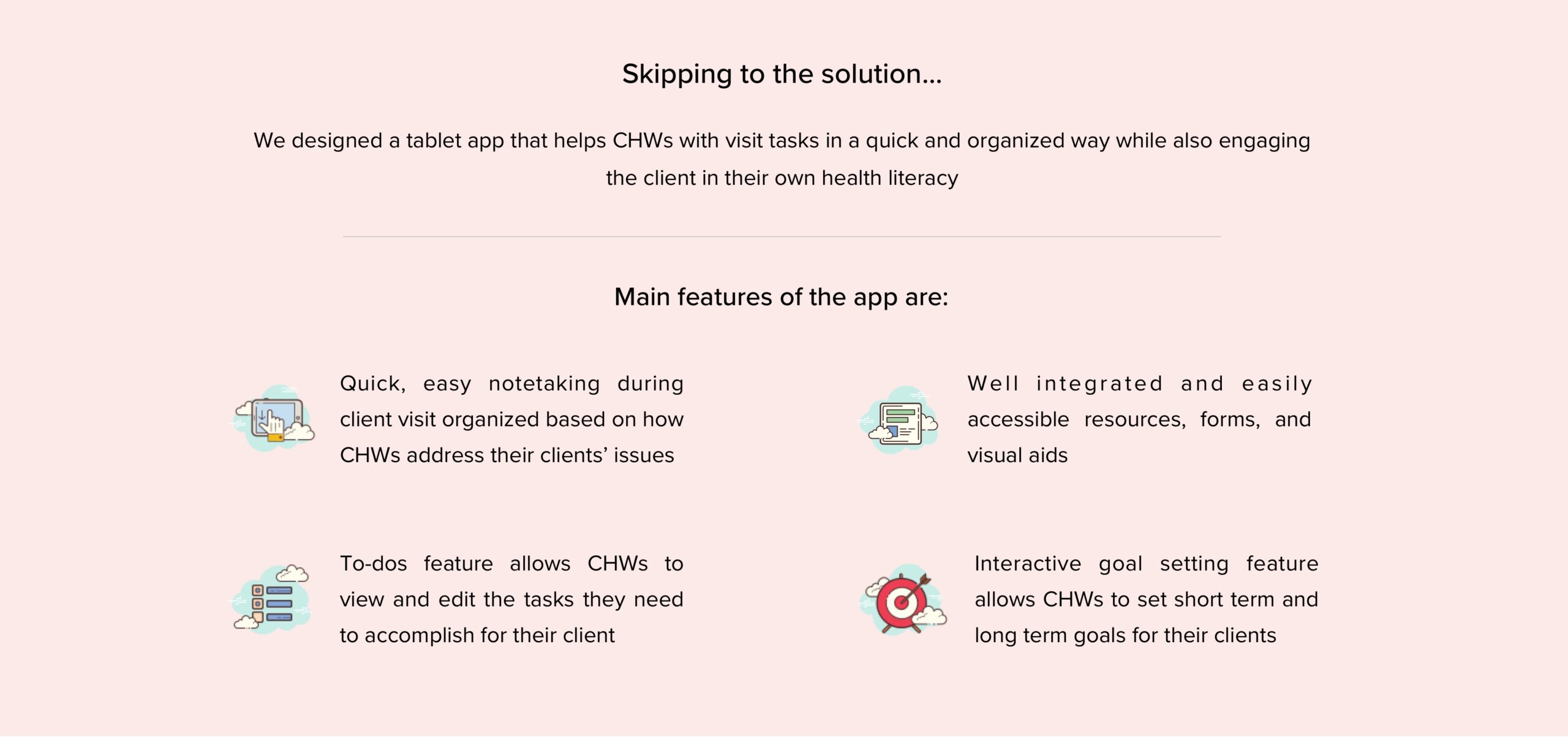
As a part of my capstone, I worked on designing an app called VisitMe, which is an interactive tablet app that aims to assist community health workers in their client interactions and streamline their daily tasks.
ROLE
Communication with the client
Information Architecture
User Flows
Interaction Design
TEAM
5 members
TOOLS
Figma
InVision
Who is a Community Health Worker?
Short Answer: Health Coach!
Community health workers (CHWs) serve as a liaison between the community and the health care, government and social service systems. They are frontline public health workers who have a close understanding of the community they serve. This trusting relationship enables them to serve as a liaison/link/intermediary between health/social services and the community to facilitate access to services and improve the quality and cultural competence of service delivery. The use of community health workers has been identified as one strategy to address the growing shortage of health workers, particularly in low-income countries.
Community health workers typically have deep roots or shared life experiences in the communities they serve. They share similar values, ethnic backgrounds and socioeconomic status and usually the same language as the people they serve.
Main roles of a Community Health Worker:
1. Promote health literacy within a community by assisting individuals and communities to adopt healthy behaviors.
2. Facilitating healthcare and social service system navigation.
3. Promote access to services, provide health education, support care delivery, and promote advocacy.
4. Educating health system providers and stakeholders about community health needs.
5. Act as liaison or advocate and implement programs that promote, maintain, and improve individual and overall community health.

Check out the interactive prototype below:
RESEARCH
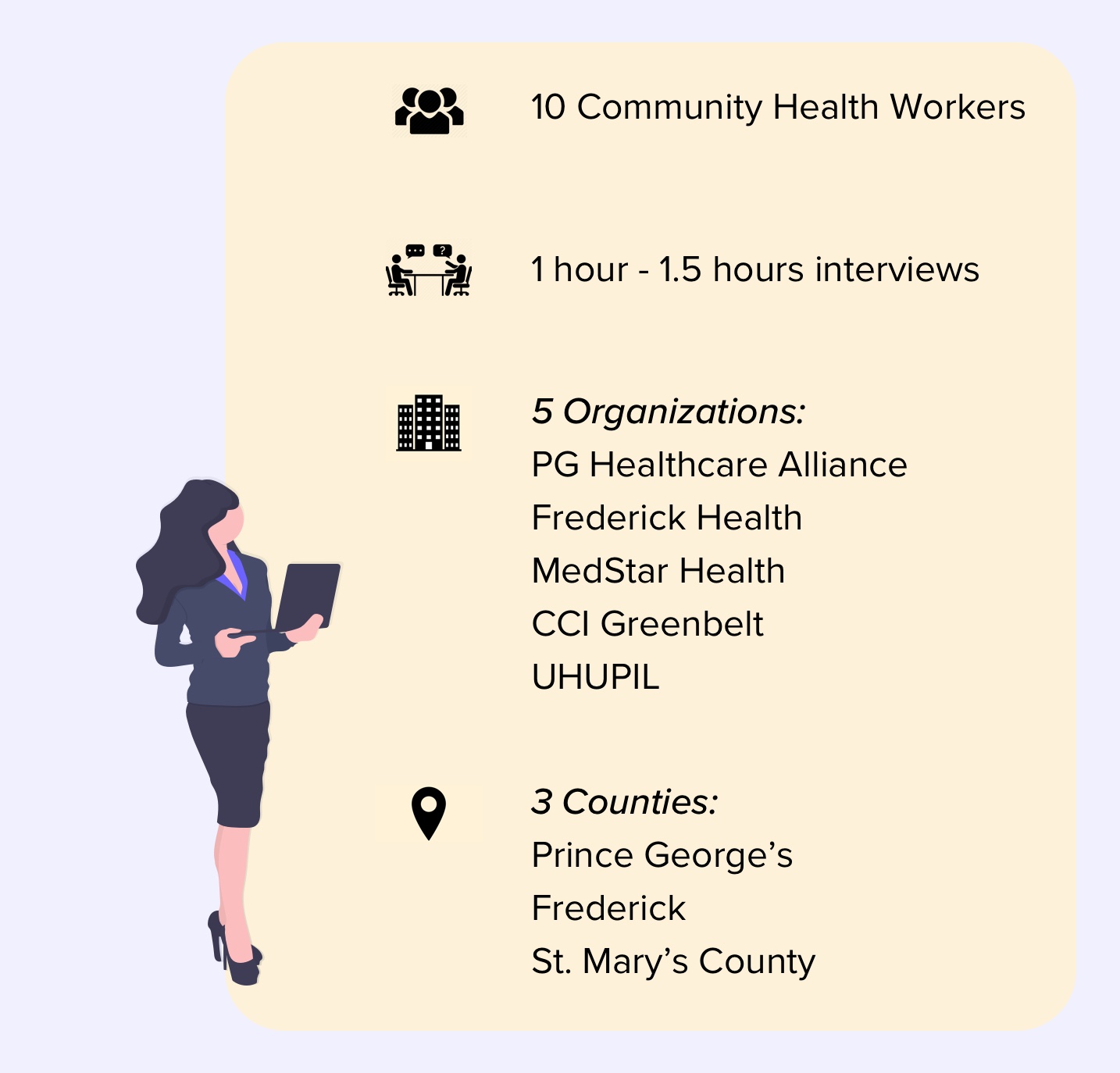
We conducted Contextual Inquiry of 10 Community Health Workers (CHWs) from 5 different organizations in Maryland.
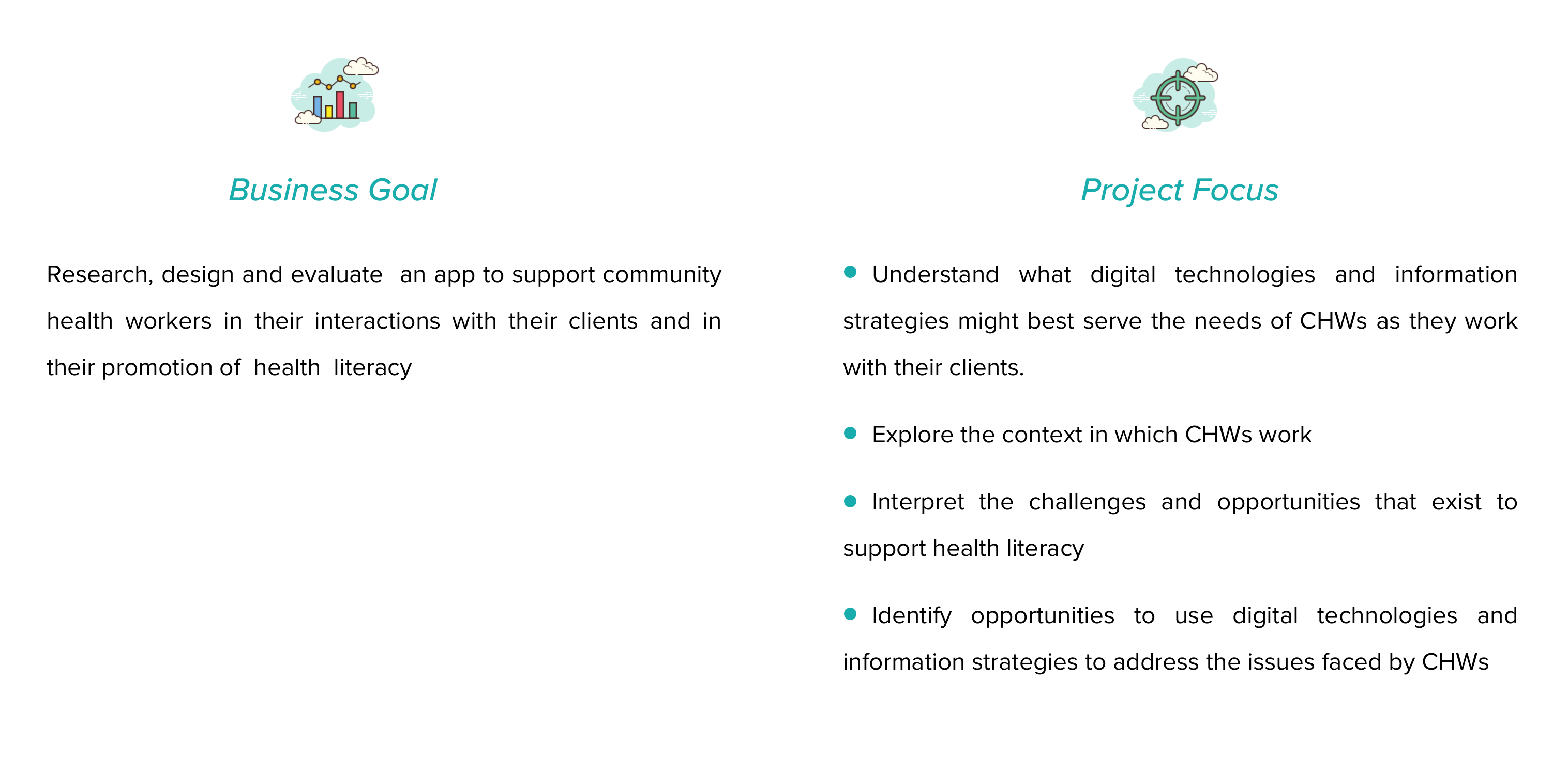
We wanted to understand:
1. CHW background and training
2. Daily personal workflow and client interactions of Community Health Workers
3. Areas of improvement in the current processes of CHWs working with their clients to support health literacy.
4. The context of CHW work and how this impacts their self-evaluation and client relationships
5. Current practices and pain points for identifying correct information for a client, acquiring that information, and disseminating that information
6. Identify opportunities where digital technologies could help Community Health Workers’ support their clients better.
FIRSTLY,
WHO ARE OUR USERS?
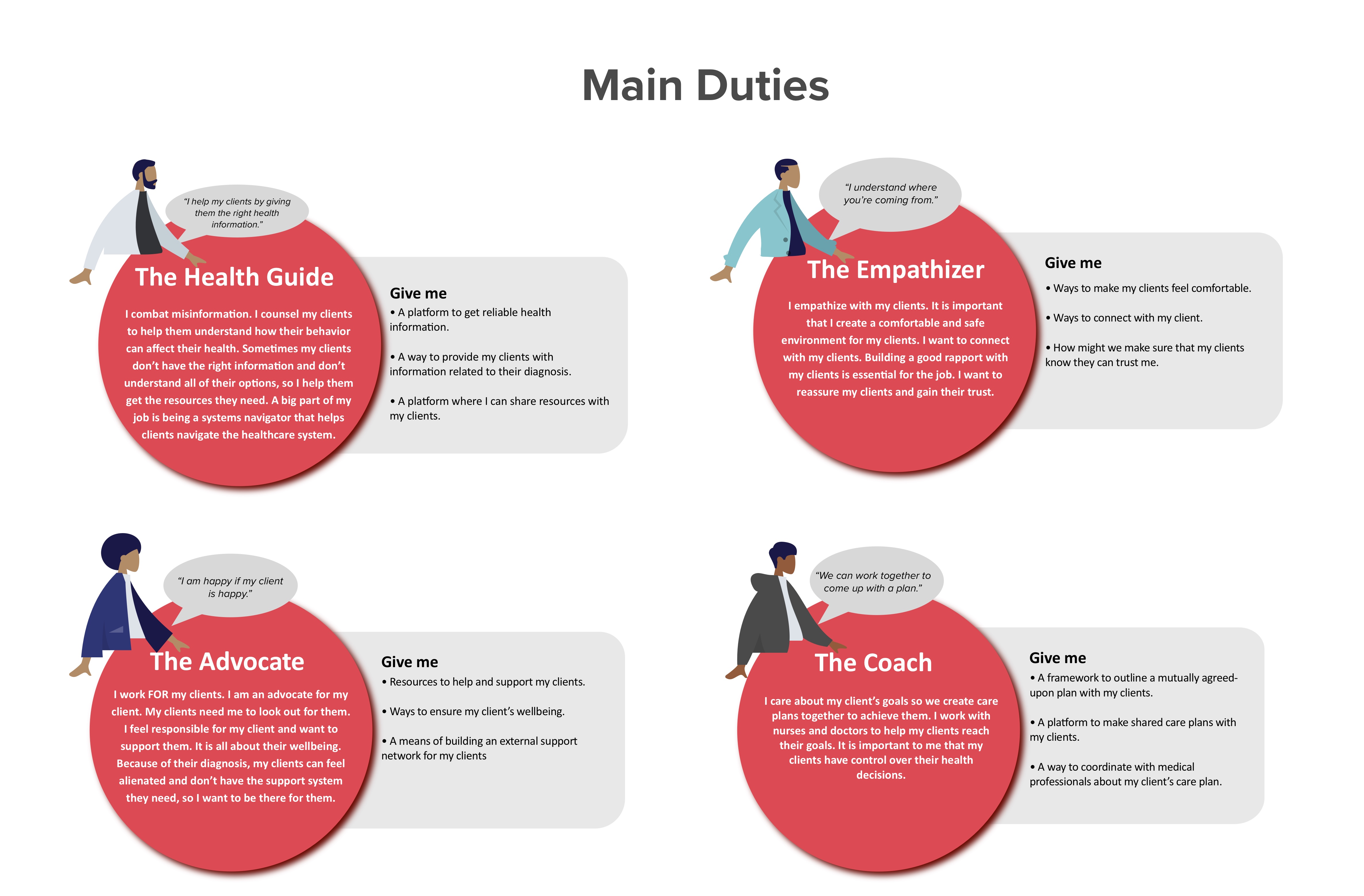
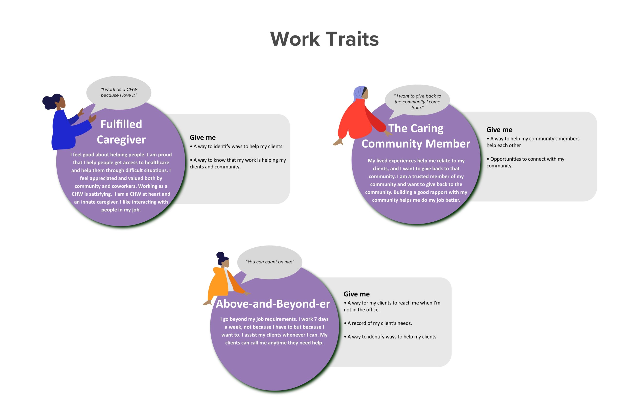
The following are the main groups of archetypical users whose goals and characteristics represent the needs of a larger group of users. These are the aspects of users’ personal identity that matter to our design. A deep understanding of a target audience is fundamental to creating exceptional products. These personas helped us answer one of the most important questions, “Who are we designing for?”
By understanding the expectations, concerns and motivations of target users, it’s possible to design a product that will satisfy users' needs and therefore be successful.
A DAY IN THE LIFE OF
OUR USERS
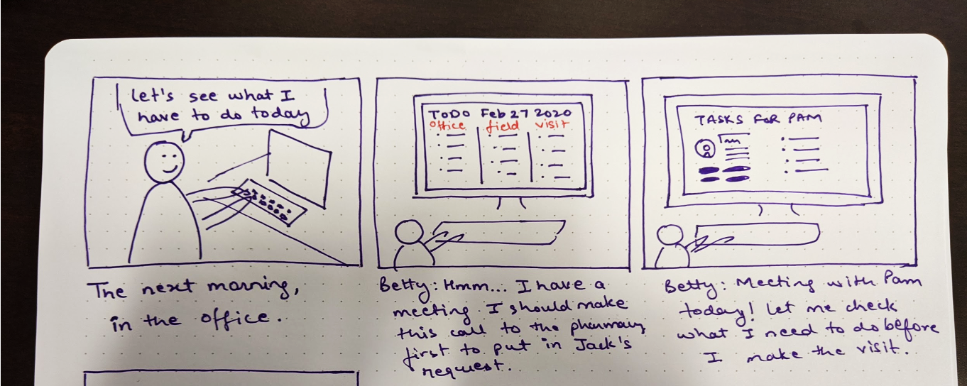
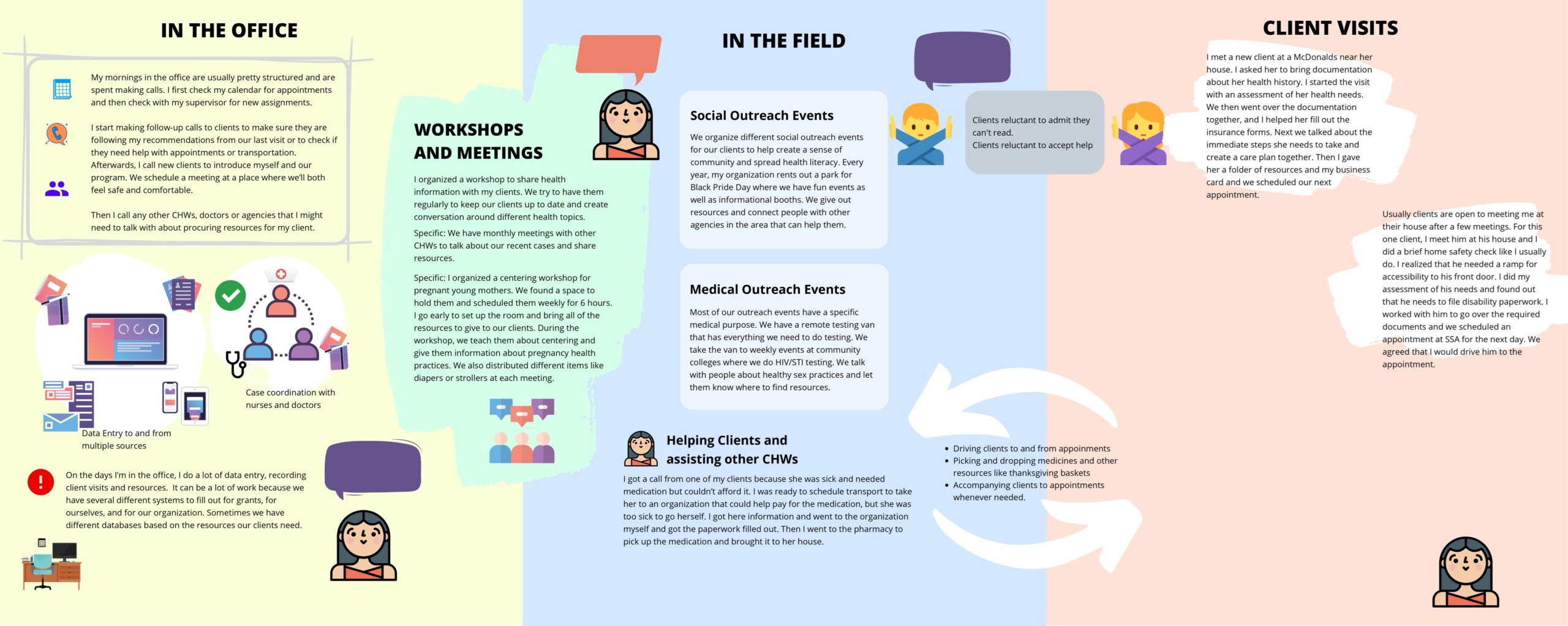
In our research phase, we discovered that our users mainly spend their time:
-> in their office
-> on the field (externals events)
-> making client visits
ANALYSIS
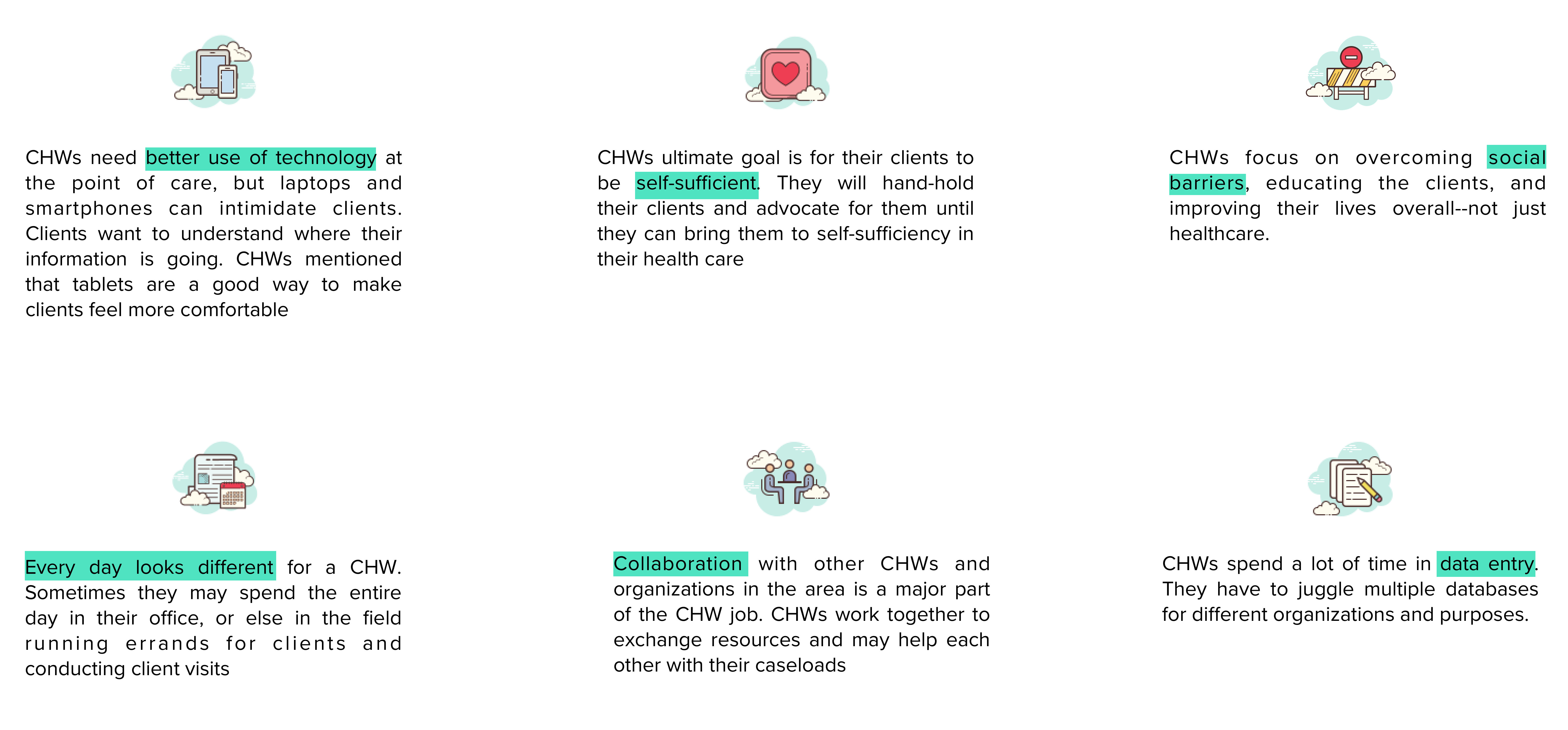
Insights derived from the analysis:
IDEATION
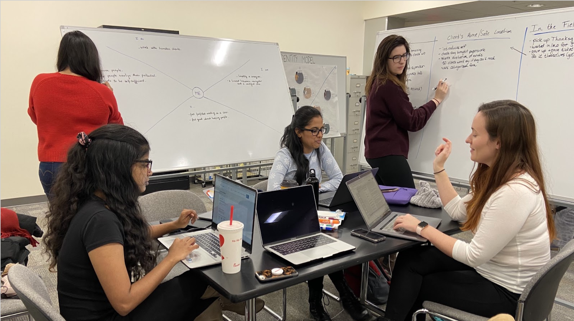
We presented our findings to the stakeholders and the CHWs we interviewed.
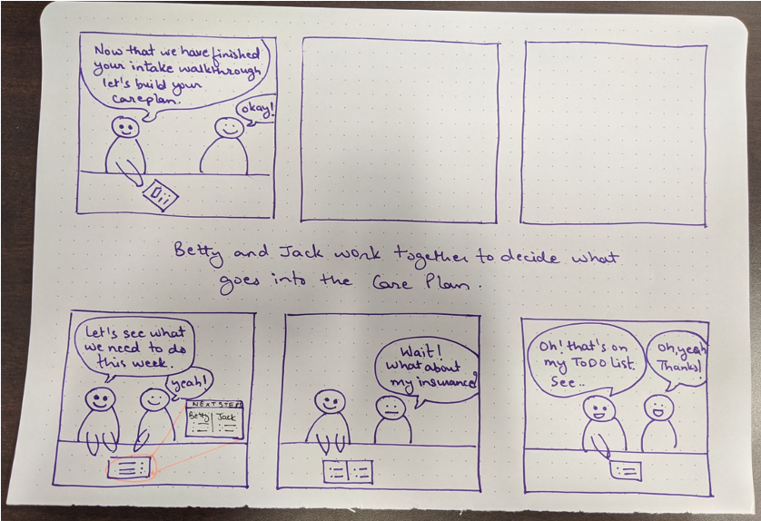
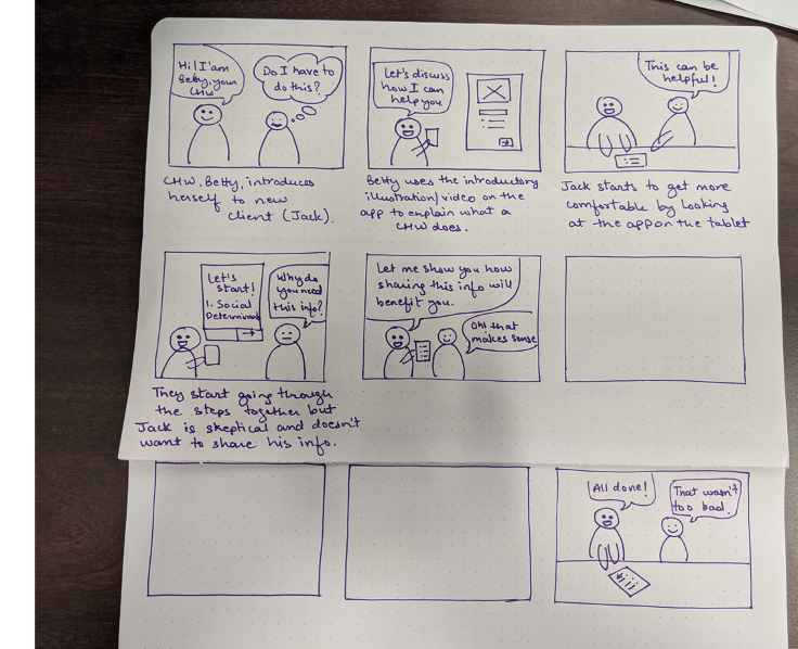
With our research findings as a starting point, we generated design ideas with the participants and came up with a list of pain points and ideas to guide our design.
CO-DESIGN SESSION
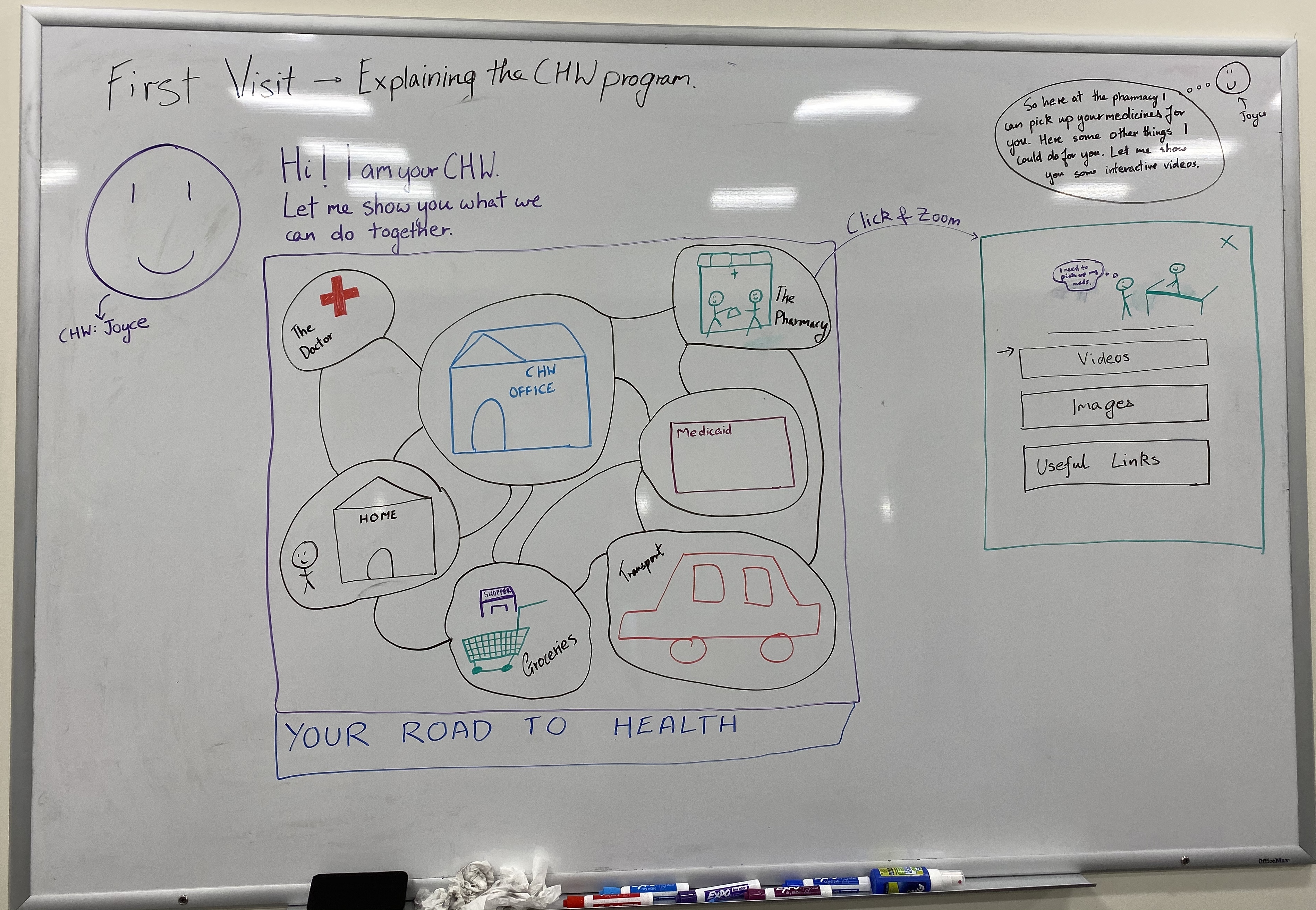
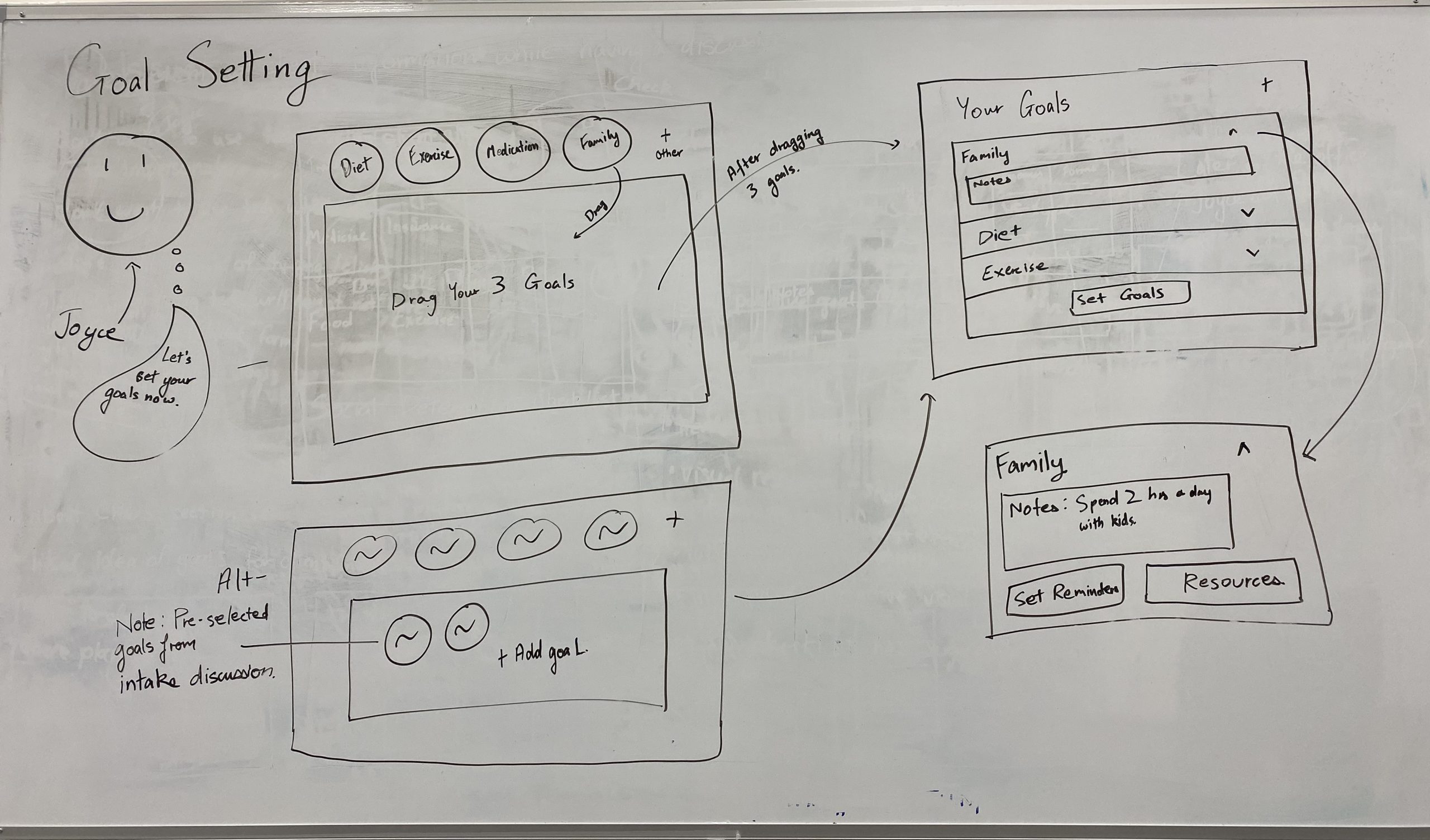
We managed to brainstorm several designs during the ideation session. Next, we conducted a 3-hour participatory co-design session with 4 of our users (CHWs) to validate and brainstorm ideas for our product concept. Our intention was to involve users with different perspectives early on in the design phase in order to help us determine the real problem space, leading to user-centered solutions.
Findings:
● Client visits are organic conversations, not structured
● They touch on a consistent list of topics called Social Determinants of Health
● “Less words, more pictures”
● Resources and visuals are important aids for health literacy throughout entire visit
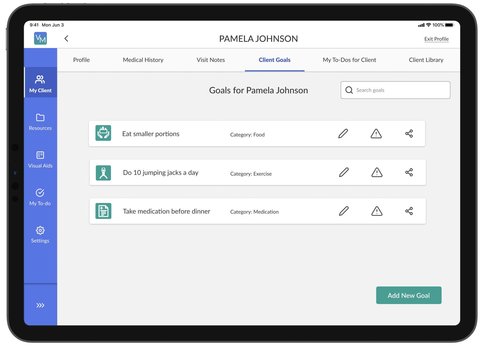
● CHWs set a few short-term goals with clients in addition to long-term goals

INFORMATION ARCHITECTURE
After identifying a solid set of major features, we mapped out the information architecture to show the hierarchy of major and minor features. This gave us an idea of how to organize content and how many interactions or screens it would typically take to complete a task.
(Zoom in to read contents)
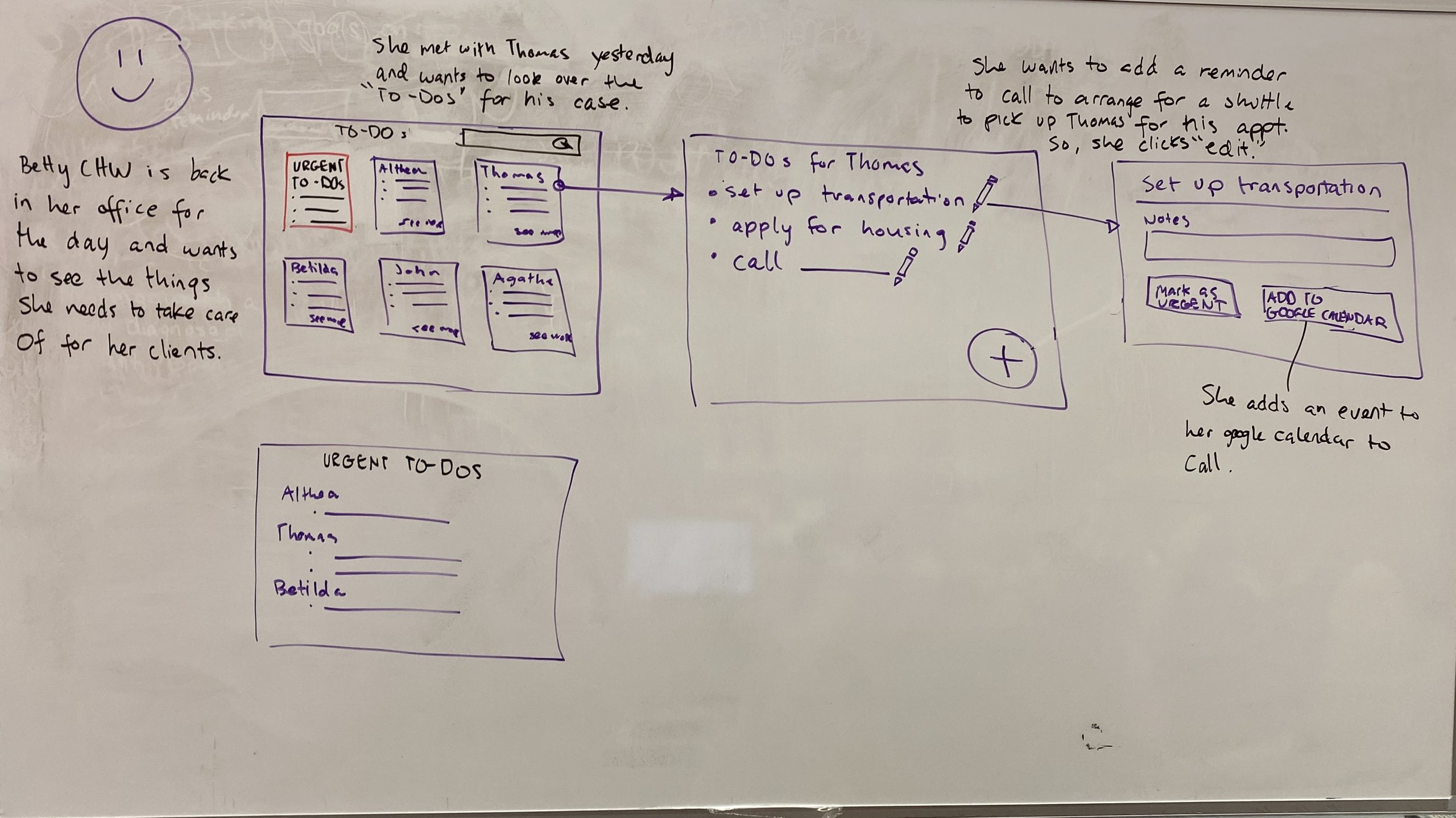
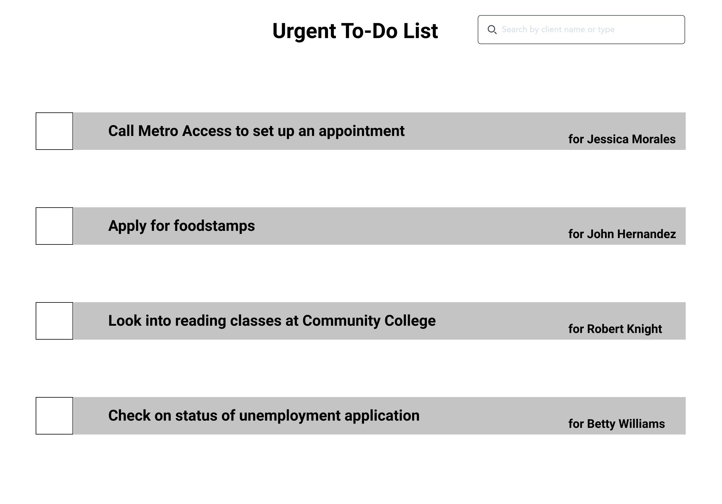
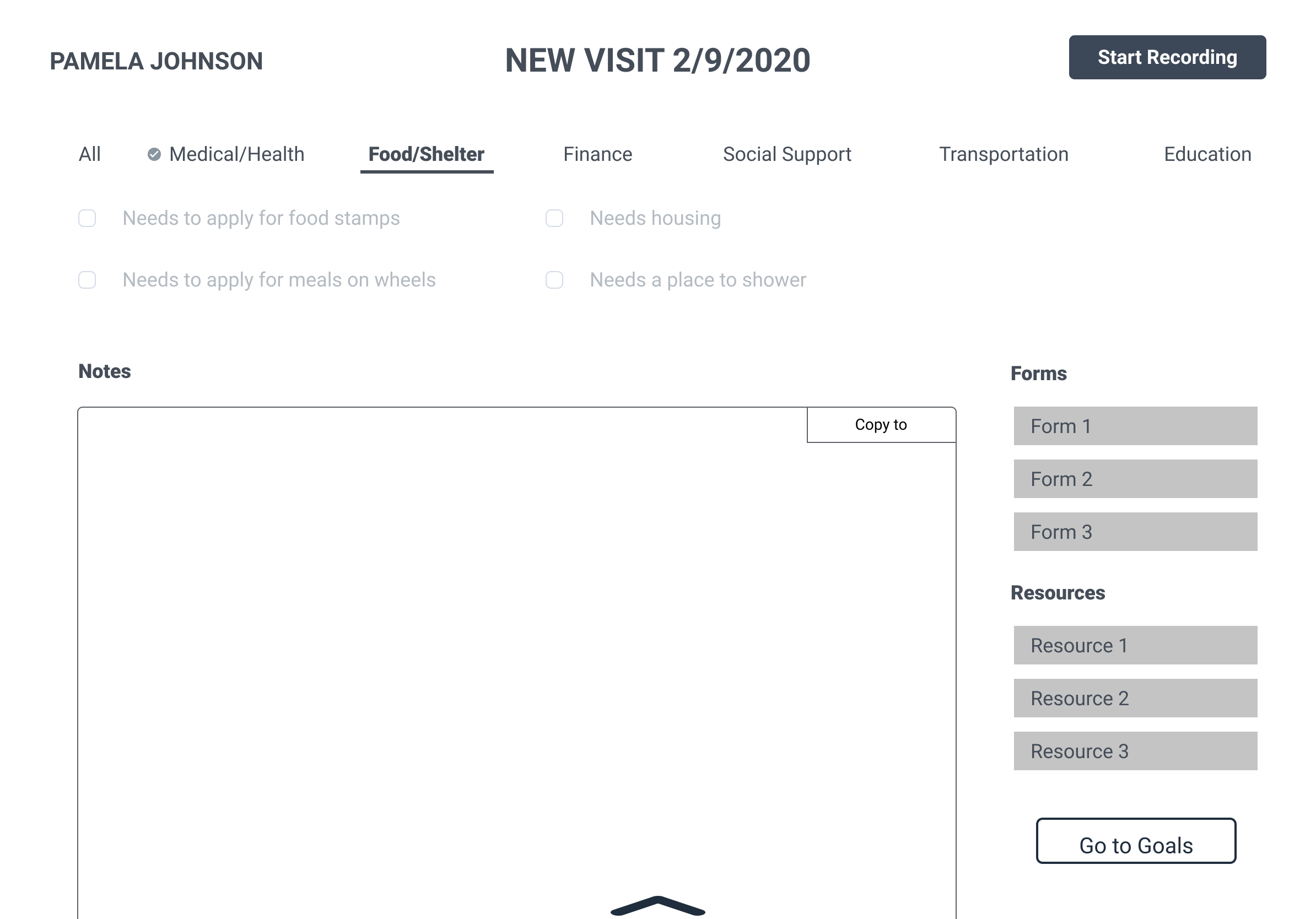
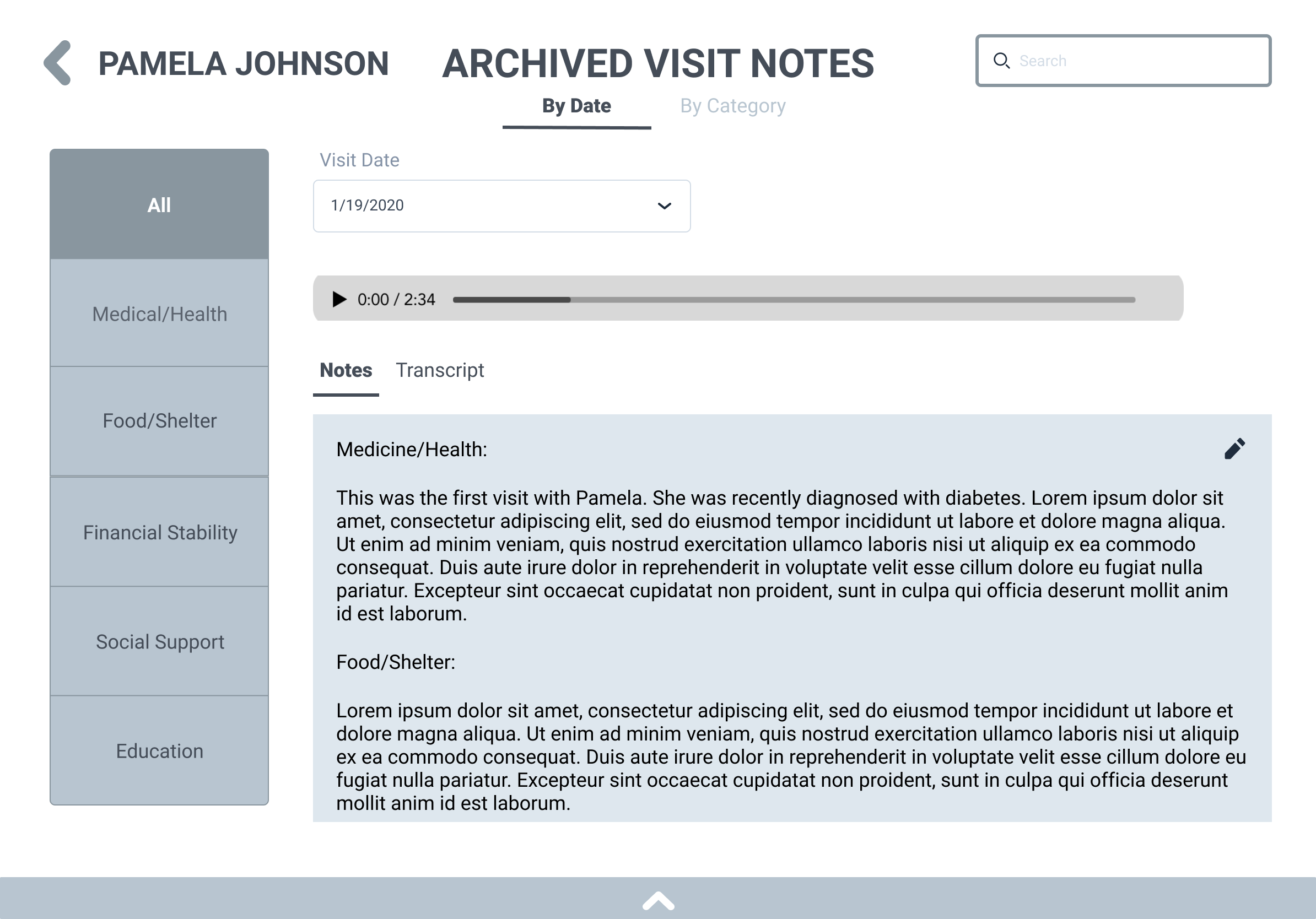
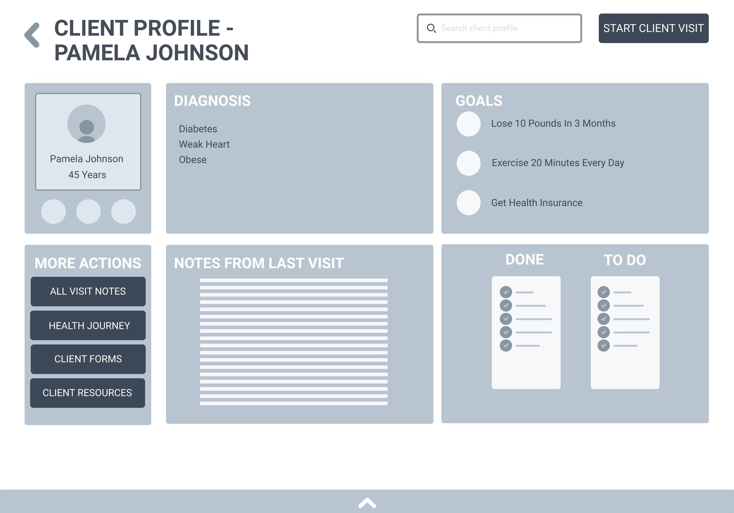
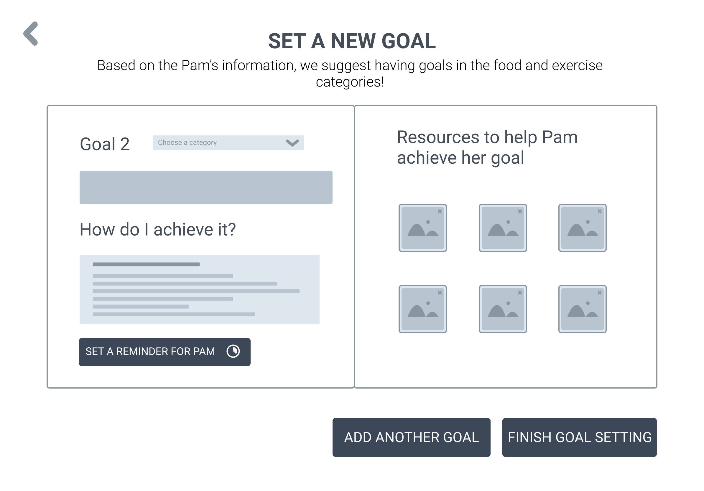
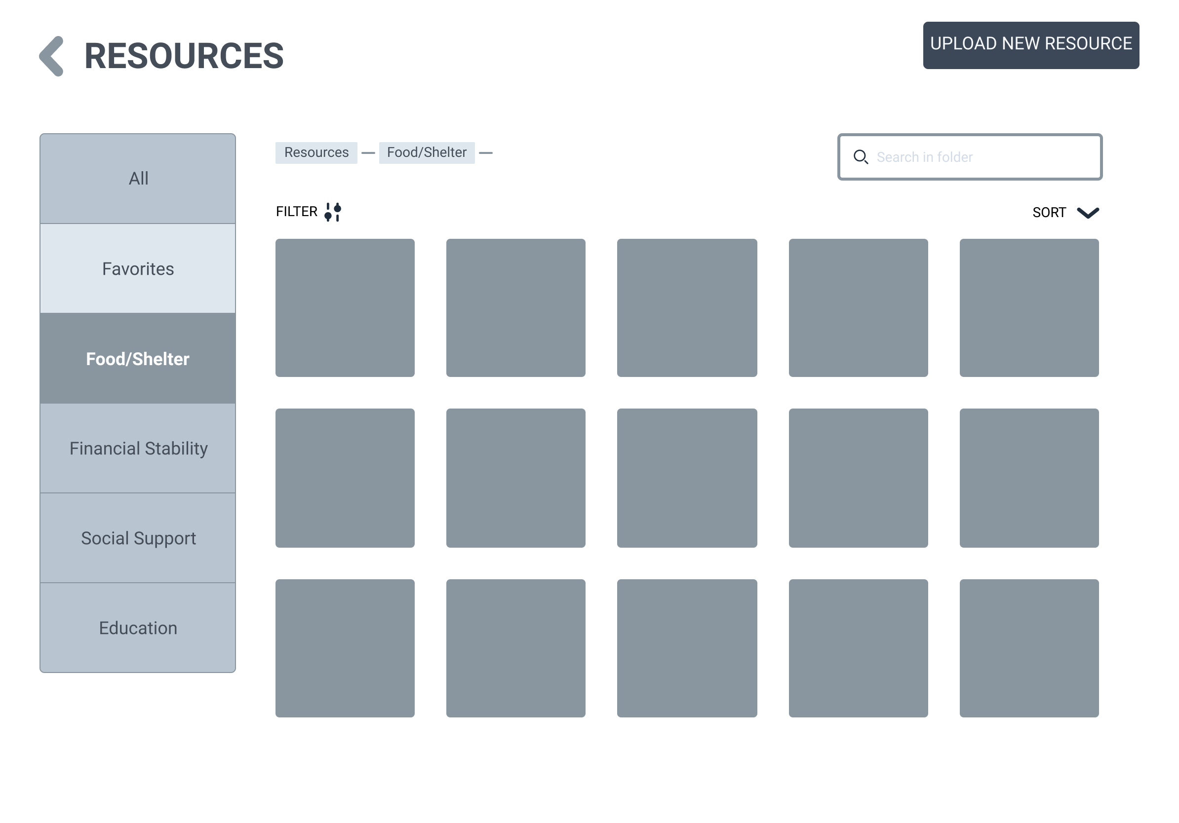
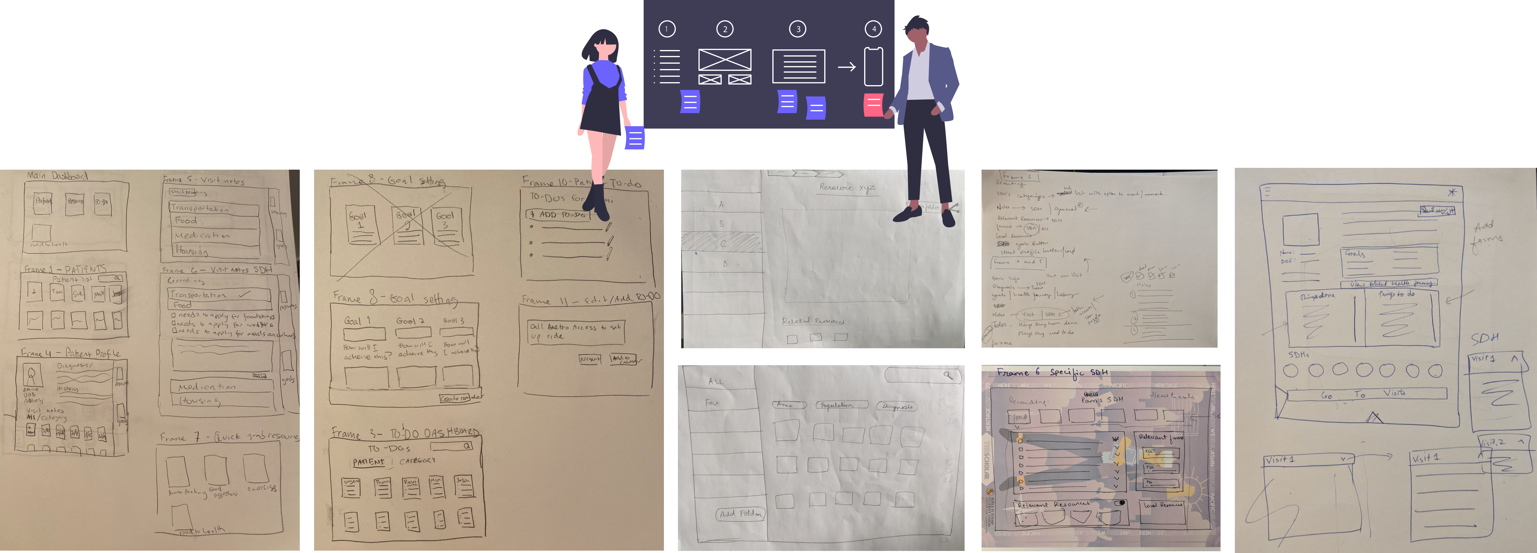
WIREFRAMES
USER TESTS

We conducted 3 rounds of remote user tests via Zoom to evaluate the wireframes with our representative users. Testing early during the design process enabled us to prevent future re-design costs and to launch a user-friendly product. These user tests allowed us to identify problems in the design of our product, uncovered opportunities to improve the various features and helped us learn about the users' behavior and preferences.
ROUND 1
ROUND 2
After each round of user tests, we had a chance to re-evaluate our design decisions and iterate on our designs. Once we made improvements to the existing wireframes, we conducted the next round of user tests.
STYLE GUIDE
Icon license: Icons are from feathericons.com
Feathericons is under MIT License: https://github.com/colebemis/feather/blob/master/LICENSE
“Permission is granted, free of charge, to any person obtaining a copy
of this software and associated documentation files (the "Software"), to deal
in the Software without restriction, including without limitation the rights
to use, copy, modify, merge, publish, distribute, sublicense, and/or sell
copies of the Software.”
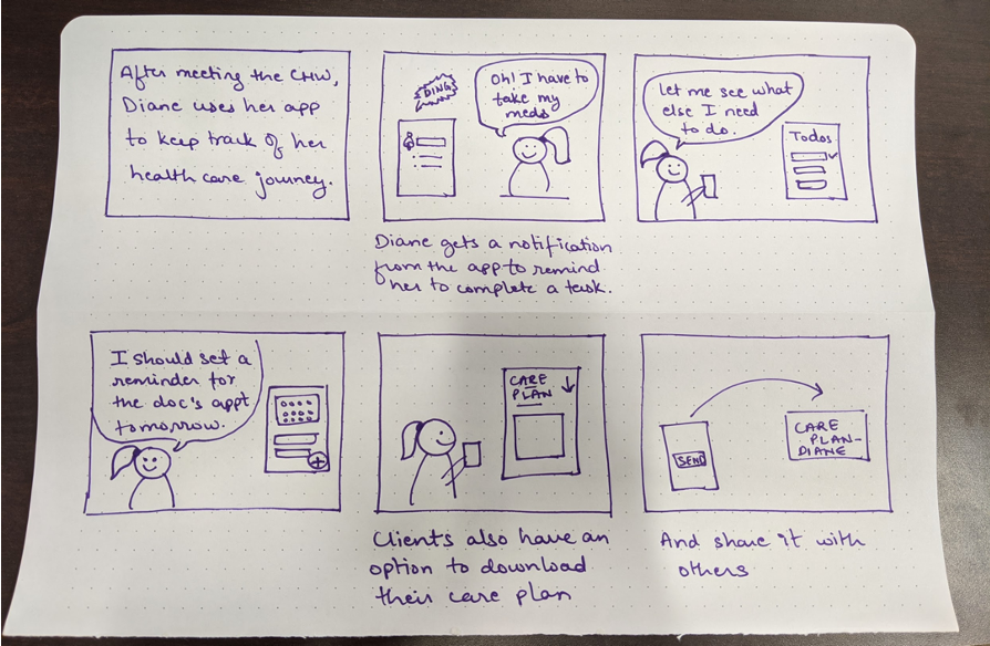
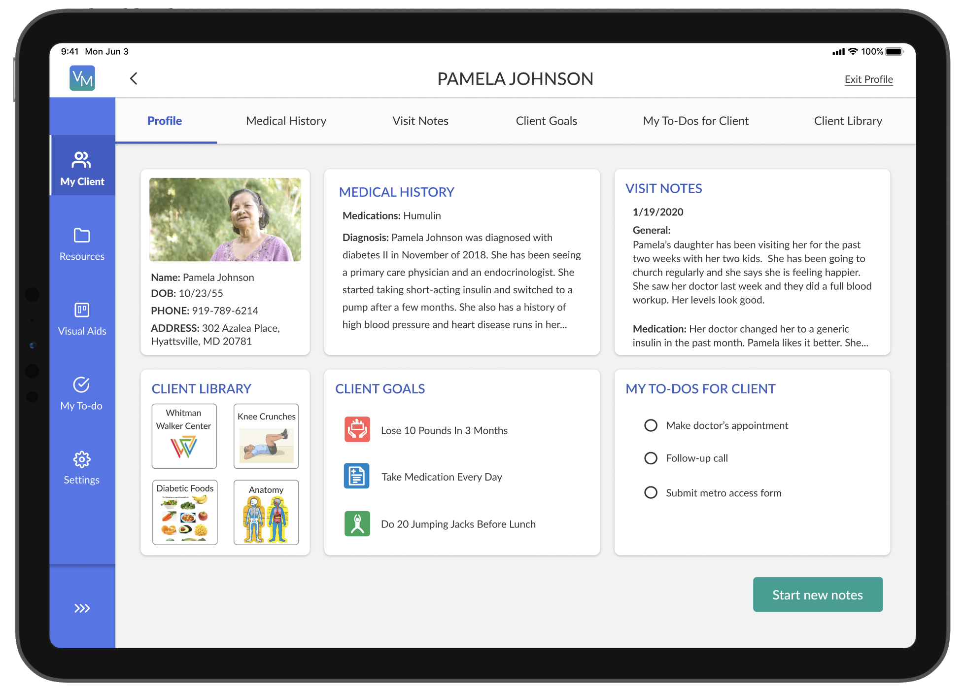
FINAL PRODUCT
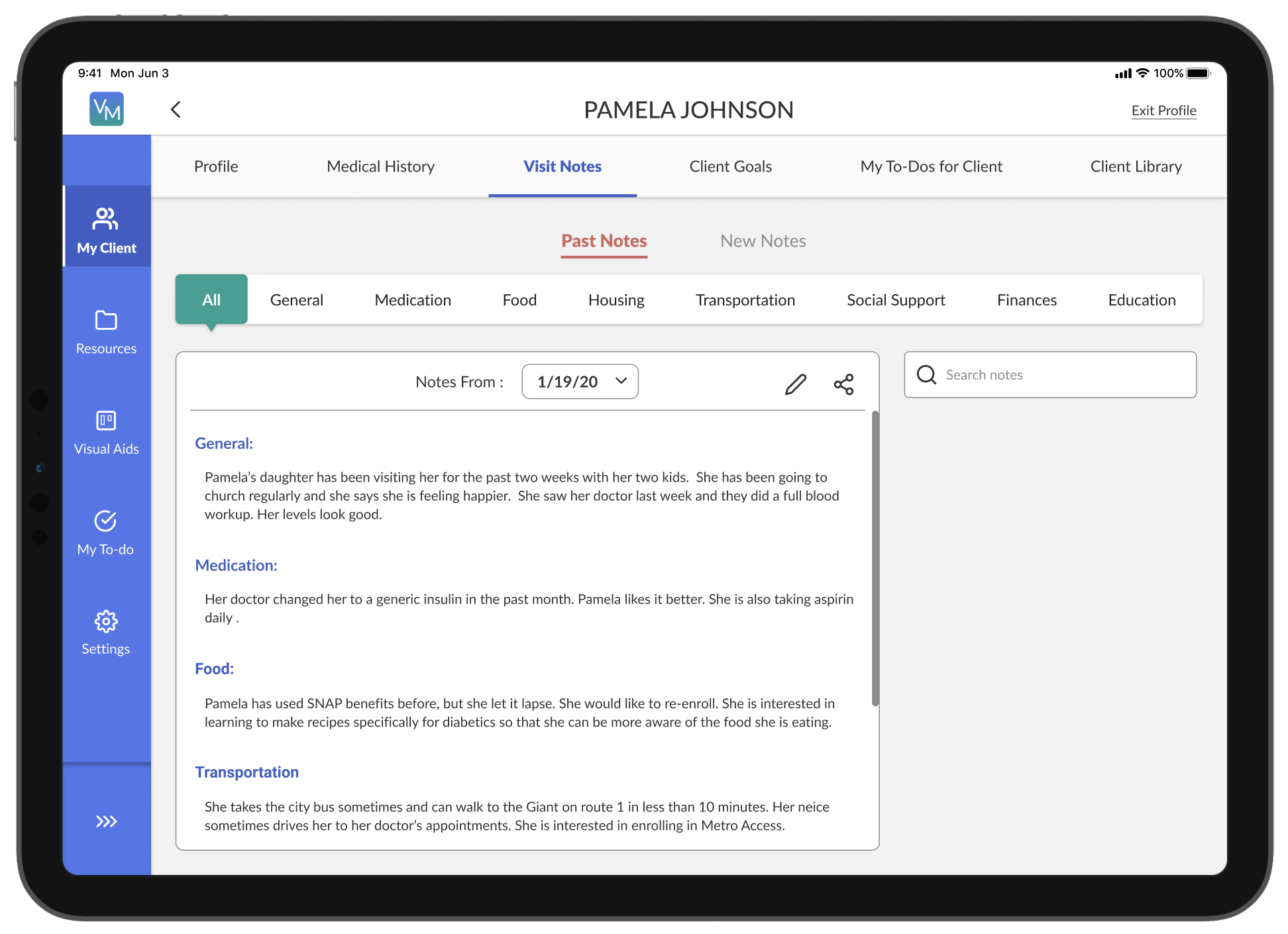
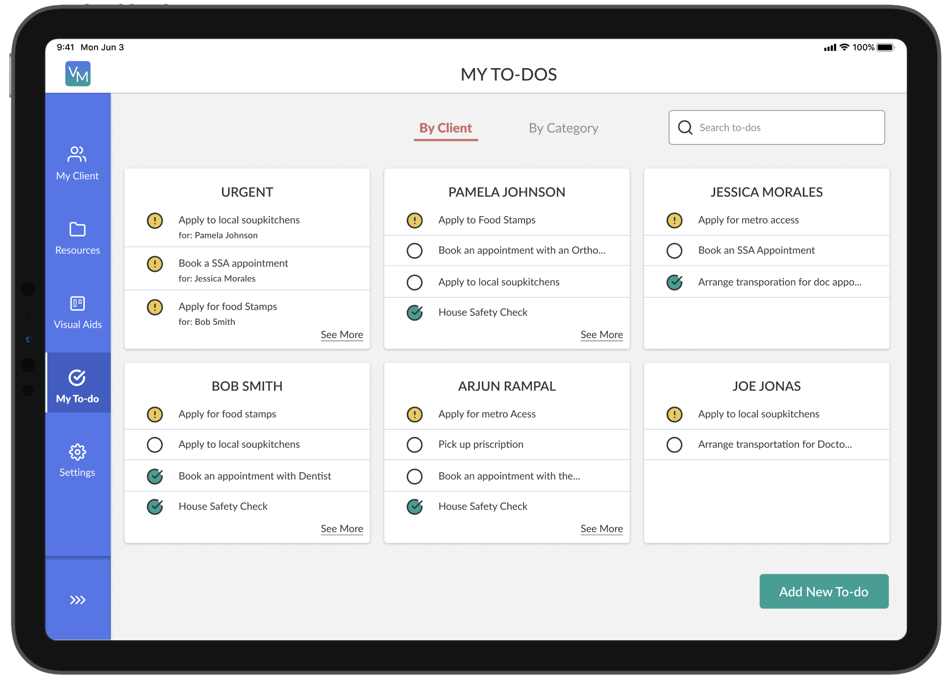
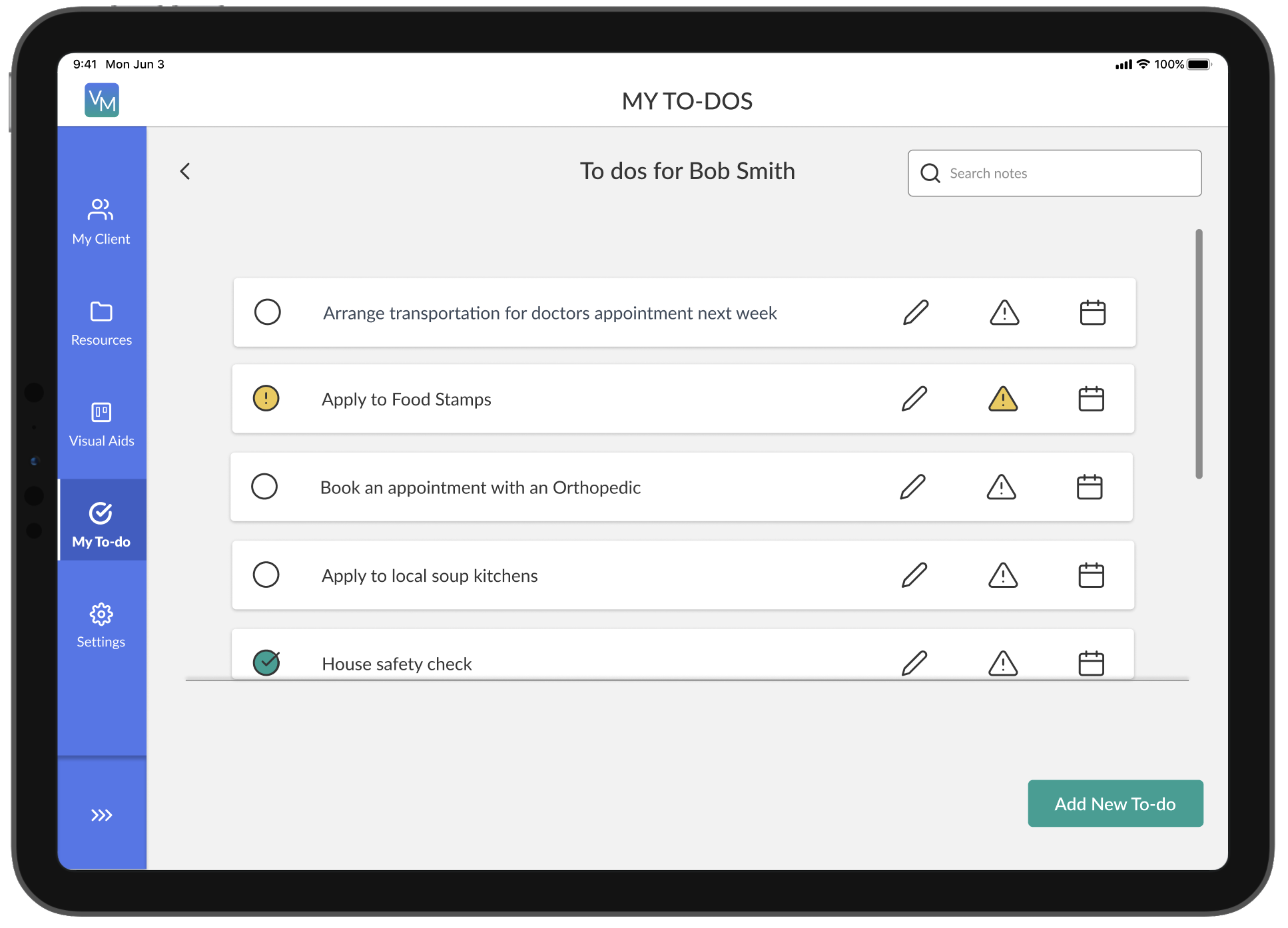
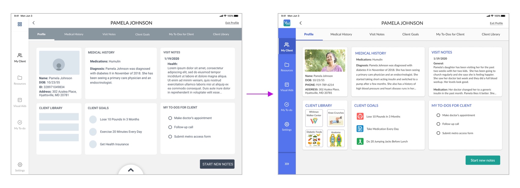
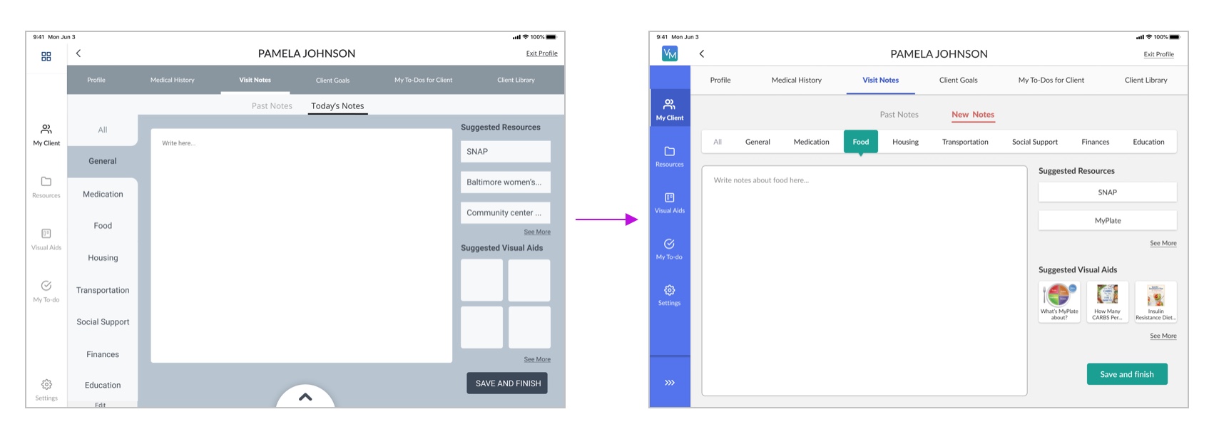
Transitions of some screens using the style guide:


LEARNINGS
Gained practical experience working with real clients and actual requirements.
My learning curve during this project has been tremendous - I was very closely and deeply involved in the project from the research phase until the phase where we handed over the deliverables.
As a team, we learned to adapt ourselves to the unprecedented circumstances presented to us by COVID-19! We conducted all our team meetings and user tests remotely.
Selected Works

Microsoft GamingDesigning and shipping Warcraft Rumble's game page

Goldman SachsEnhancing the Agent UI Experience

Base UI Design SystemBuilding & maintaining Blizzard's design system

PulseProtocolImproving usability of doctor profiles to scale business and increase revenue

